QuadPay, 2020
Revamping Order Management
In 2020, as the sole product designer for QuadPay, a rising buy-now-pay-later app, I led the redesign of the order management experience to improve visual clarity and communication across order statuses. Collaborating with product, tech, analytics, and customer experience teams, I helped transform the product from a basic MVP into a data-driven solution that addressed key user pain points. This redesign significantly reduced customer support calls, decreased late payments, and boosted user engagement. By combining user-centered design principles with cross-functional collaboration, we delivered a seamless experience for QuadPay’s 1.5 million users while meeting critical business KPIs.
Objective
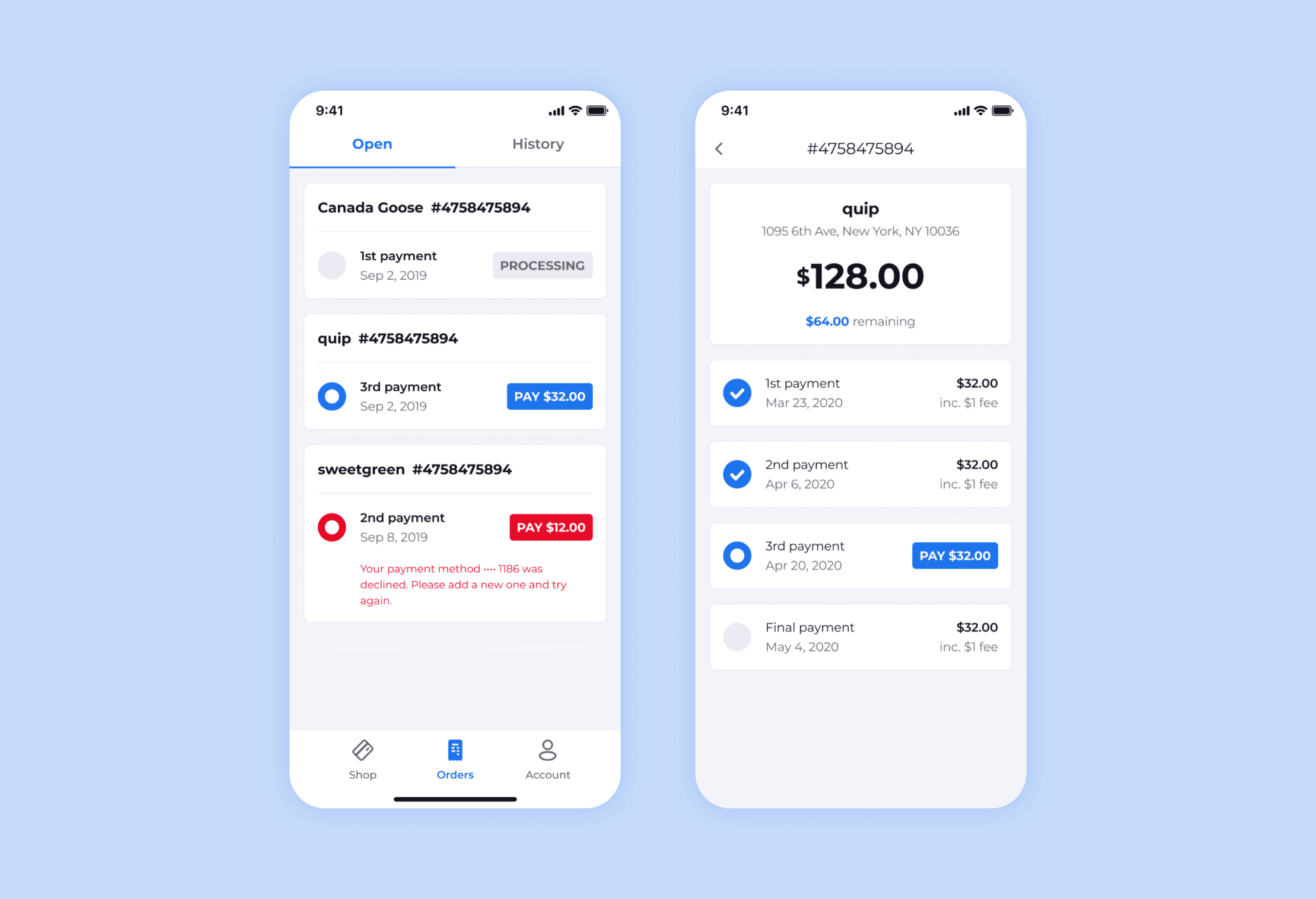
The order management experience was critical to users, as it directly impacted how they tracked their purchases and payments. However, the existing design lacked clear guidance on how to access more details about specific orders, and the order cards themselves were short on key information, leaving users confused about the status of their transactions. Additionally, the information architecture of the cards was unbalanced, making it difficult for users to quickly grasp important details. This confusion not only frustrated users but also drove high call volumes to customer support.
Existing Orders experience in the QuadPay app.
Recognizing the importance of addressing these issues for both users and the business, I stressed the importance of a user-centered design approach to refit it with clearer, more specific information that was critical to users. The goal was to create a more intuitive and user-friendly experience that reduced friction and improved satisfaction.
Research
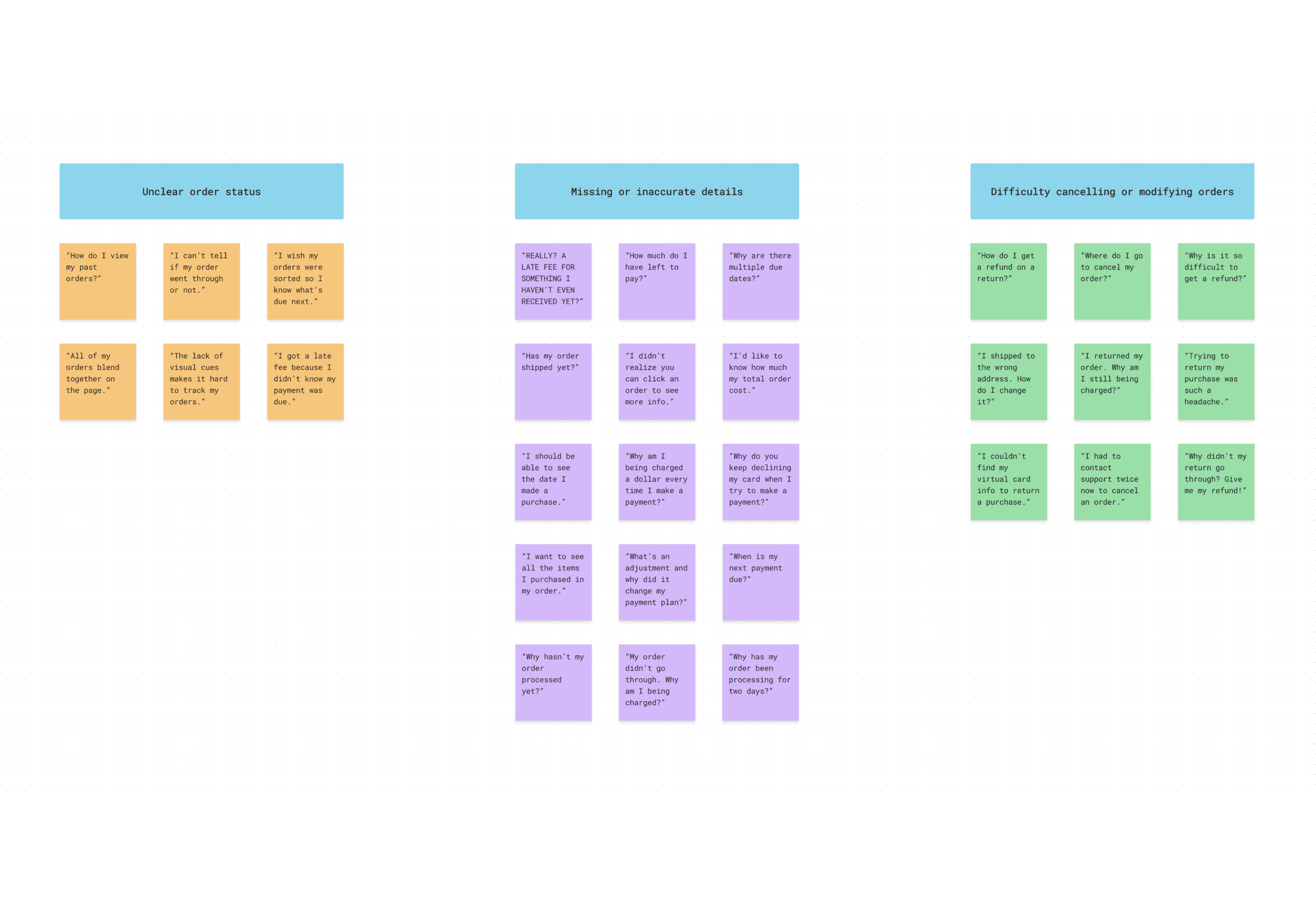
I collaborated with the product manager to improve the Orders experience, using user feedback from the customer experience team as a foundation. We identified three main pain points through an affinity mapping exercise:
Affinity map created to identify user pain points.
Unclear order status: Users struggled to understand payment due dates and order status due to unclear indicators.
Missing or inaccurate details: Many users felt the Orders page lacked essential information about their payment plans and didn’t realize more details were available through order components.
Difficulty with returns and cancellations: Users were unclear on how to initiate returns or cancel orders, leading to further confusion.
We translated these insights into “How Might We” (HMW) statements that guided the redesign:
How might we enhance order components to improve status clarity, payment visibility, and boost conversion rates by 15% quarter-over-quarter?
How might we optimize communication between users, QuadPay, and merchants to streamline returns and cancellations, maintaining a repeat customer rate of 66% or higher?
How might we reduce customer support calls and improve App Store ratings to 4 stars or higher by servicing users better in-app?
Ideation
At this point, the product manager facilitated leadership's approval while I conducted a competitive analysis of BNPL apps like Affirm, Klarna, Afterpay, and Sezzle, focusing on strengths and weaknesses that aligned with our predefined goals. Using this analysis and prior research, I developed three solutions for each “How Might We” statement, each containing three concepts to address key areas of the redesign.
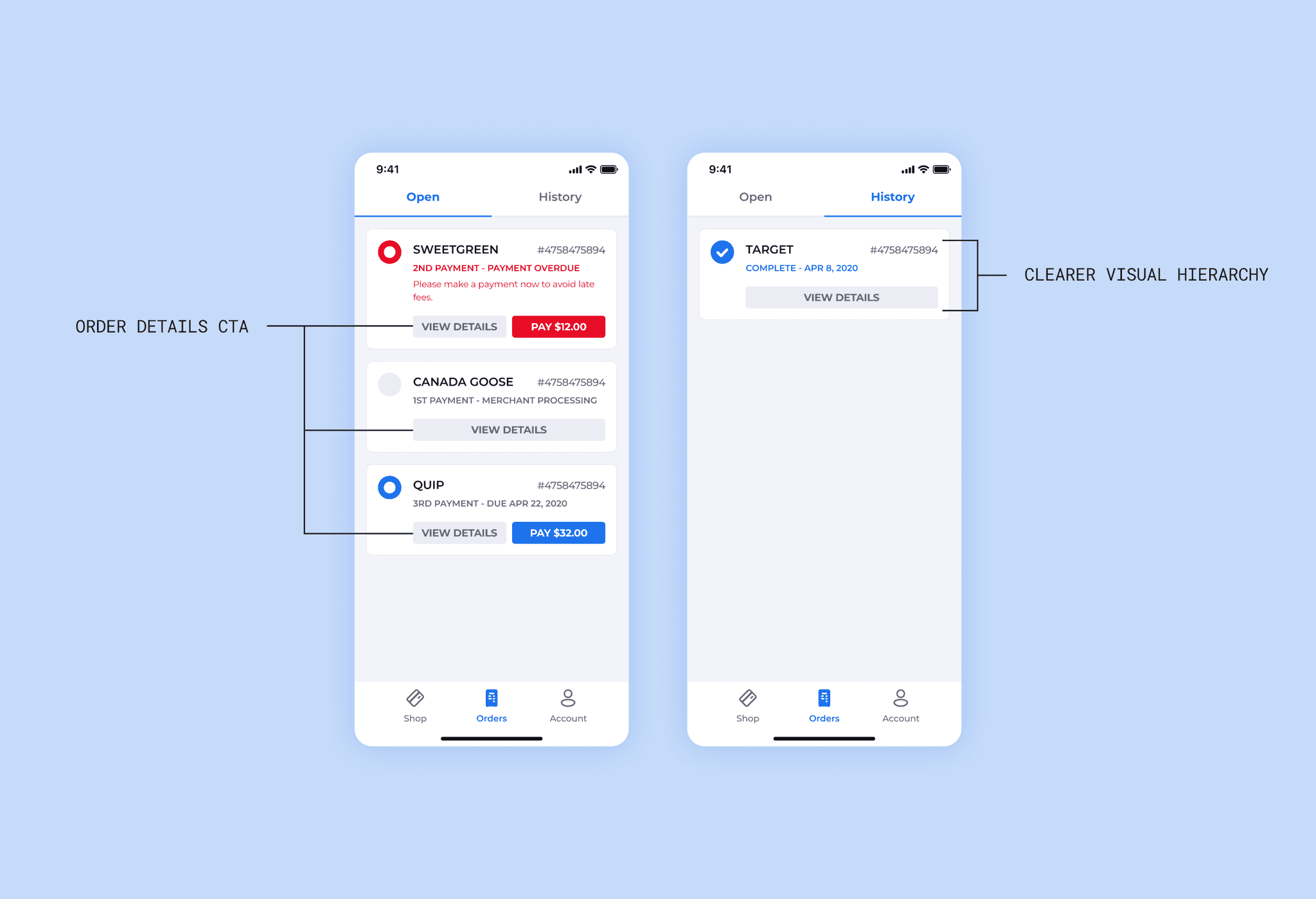
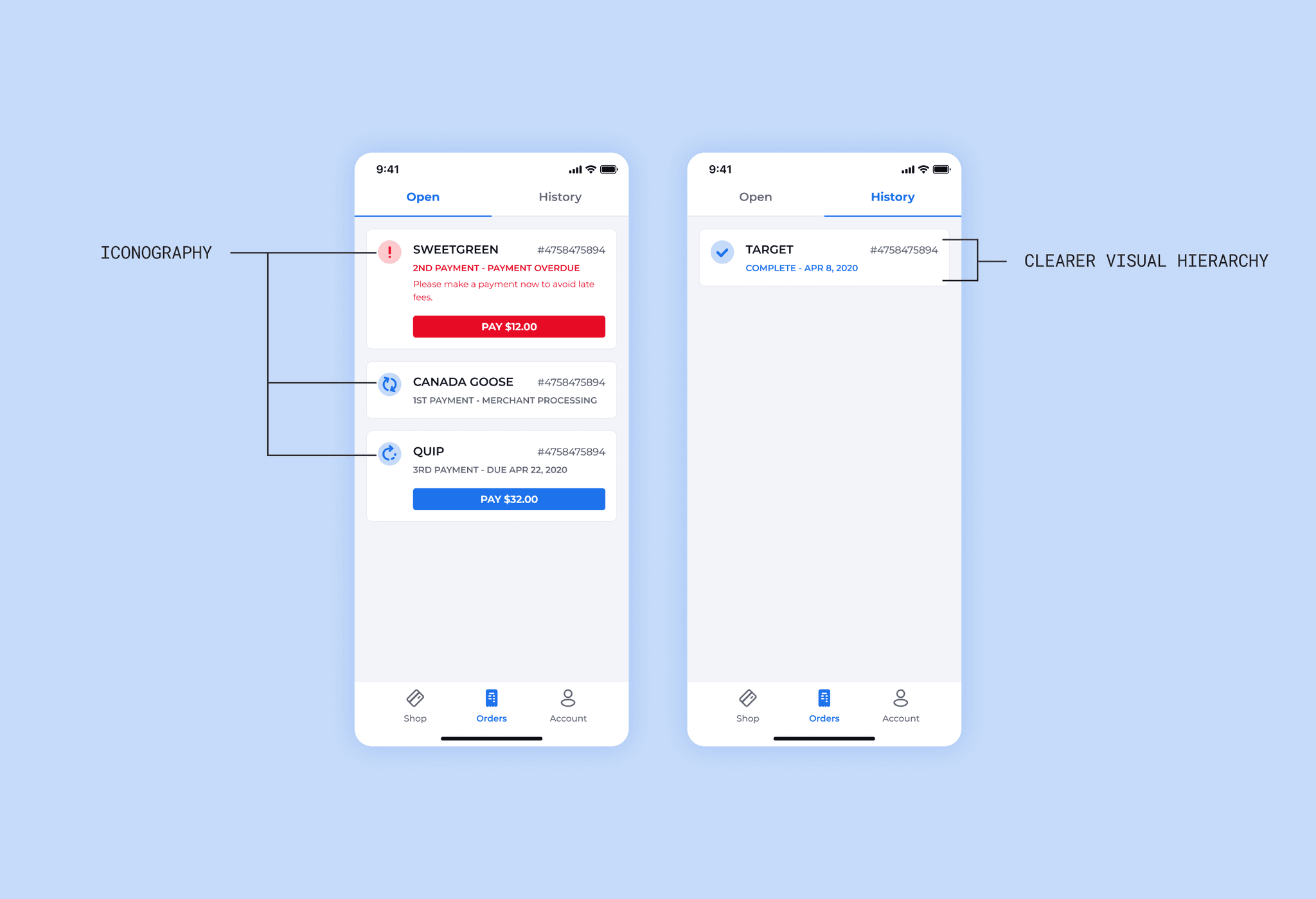
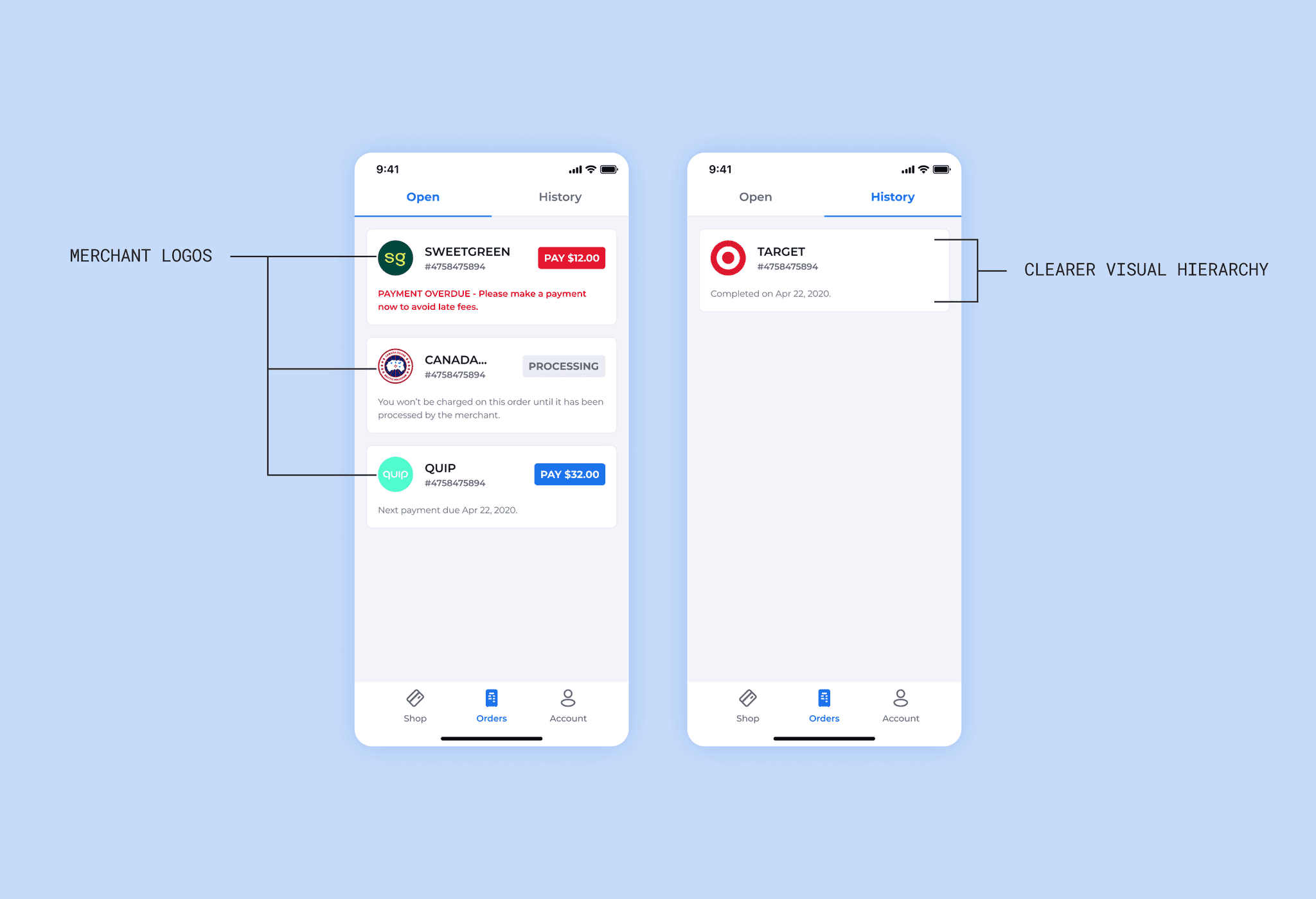
Solution 1 concepts aimed at enhancing order components.
Solution 1: Enhance order components
To enhance the order components, I explored three concepts. The first concept added a “View Details” CTA to the existing card framework, improving visual hierarchy by prioritizing key information like titles and order statuses while condensing the card height to display more orders above the fold. Orders with errors were pinned to the top to prompt action. The second concept incorporated iconography and color to indicate activity states, further strengthening the hierarchy between titles, CTAs, and order statuses. Like the first concept, it condensed the card layout and pinned error orders at the top. The third concept introduced merchant logos on order cards to provide clearer differentiation between orders, along with improved text styling and a new descriptive status line. Across all concepts, error states were highlighted at the top of the screen to encourage user engagement.
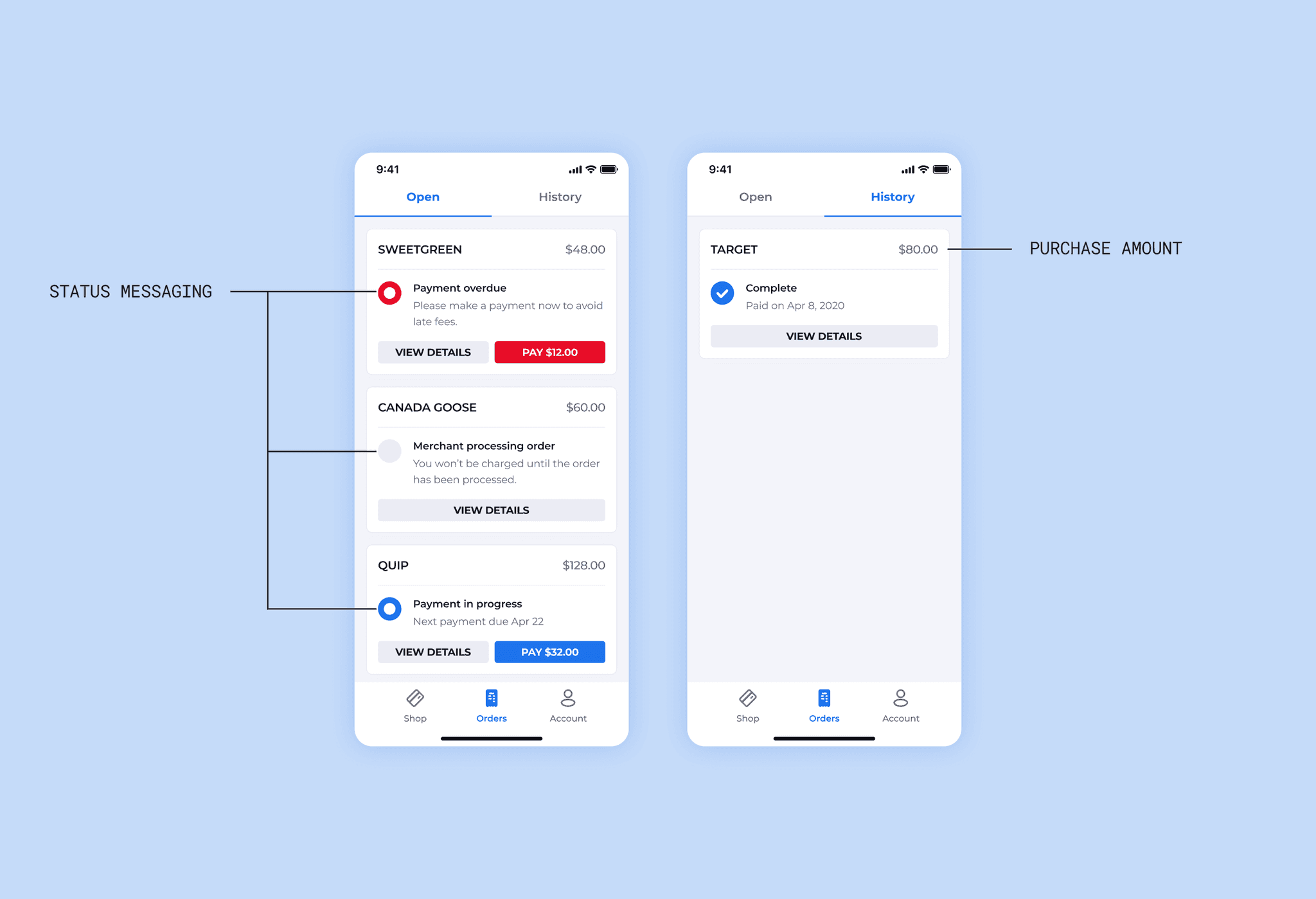
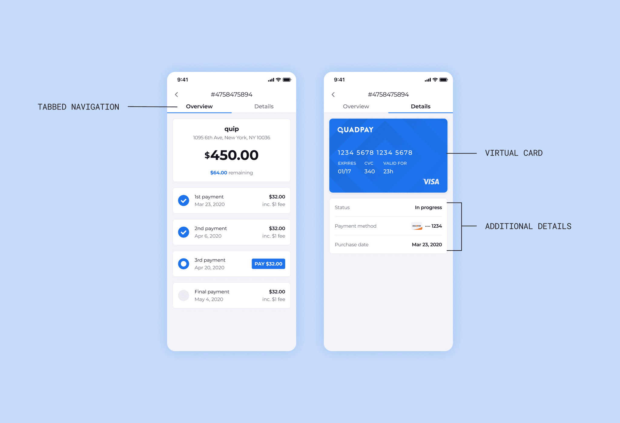
Solution 2 concepts aimed at optimizing communication.
Solution 2: Optimize Communication
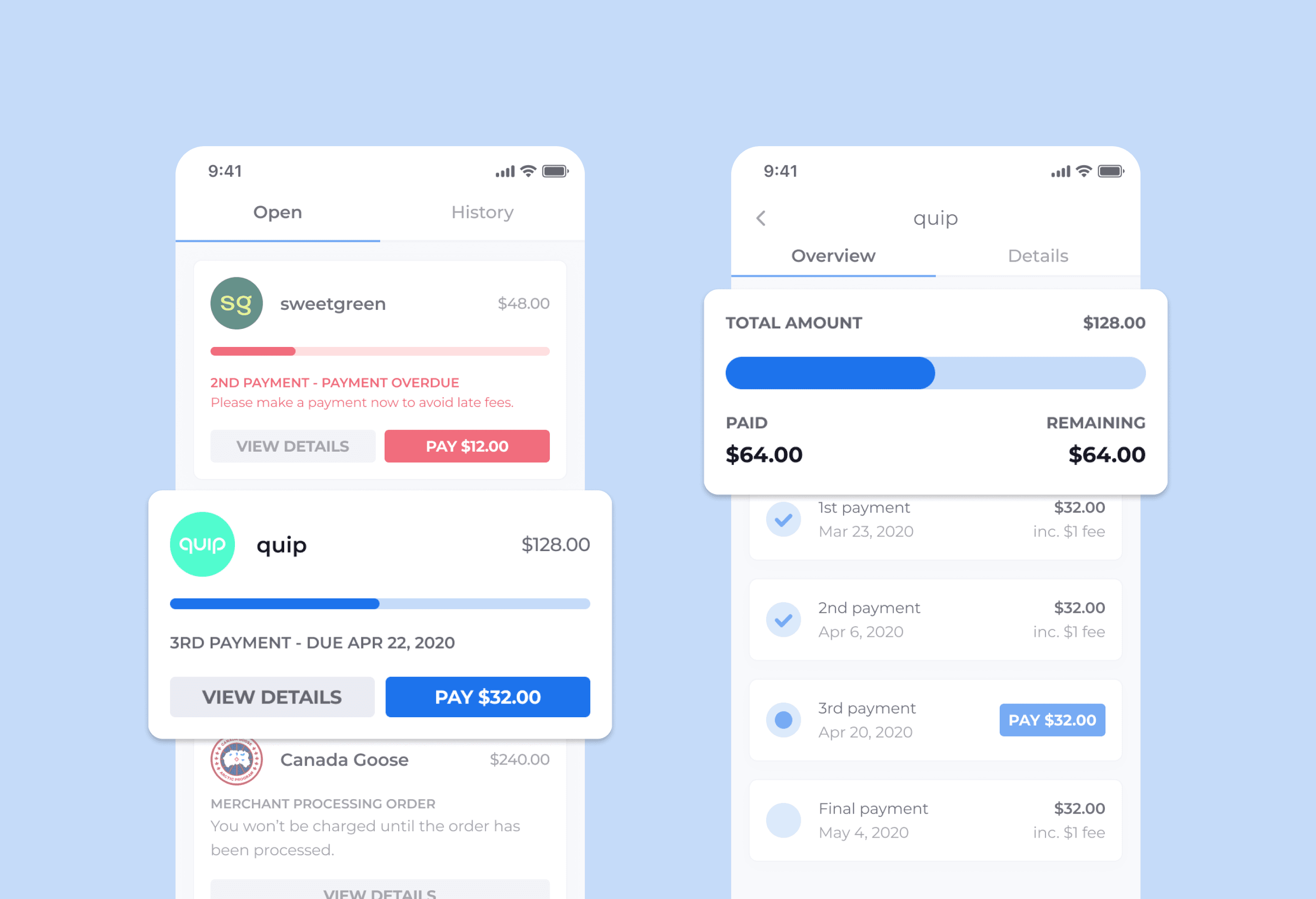
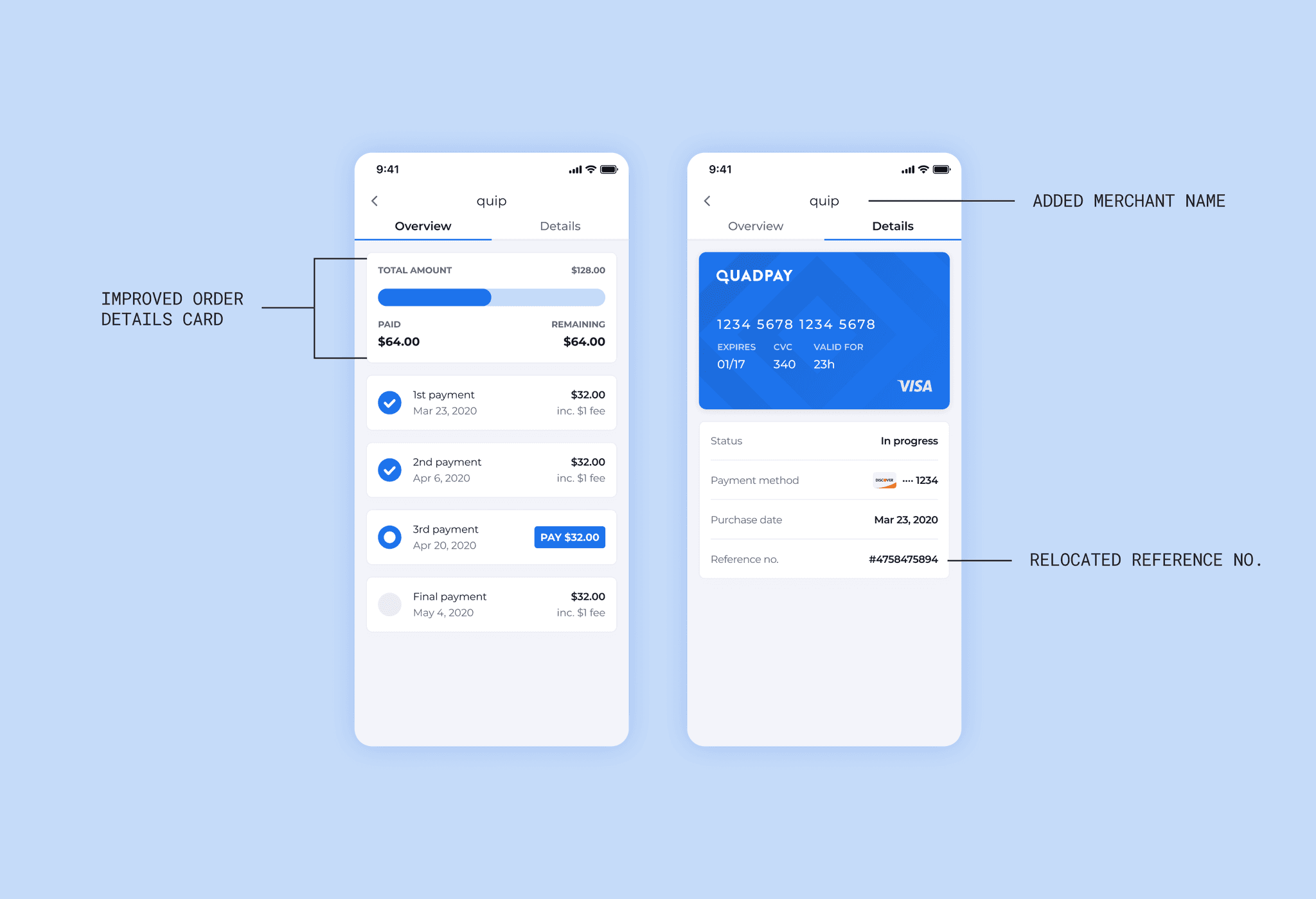
To optimize communication, I developed three concepts. The first concept focused on enhancing order status visibility by adding clearer subtitle messaging and brief descriptive text below, along with a gray-colored “View Details” CTA to guide users to the Order Details screen. The second concept introduced a new tab navigation system within the Order Details screen, allowing users to toggle between an “Overview” tab and a newly created “Details” tab. This new tab featured additional information, such as virtual card details, payment methods, and order creation date, which had previously been missing. The third concept built on this by redesigning the primary Order Details card to include a progress tracker, visually showing how much had been paid and what remained. It also moved the merchant name into the header, replacing the reference number, which was relocated to the “Details” tab for improved clarity.
Solution 3 concepts aimed at improving in-app feedback.
Solution 3: Service in-app feedback
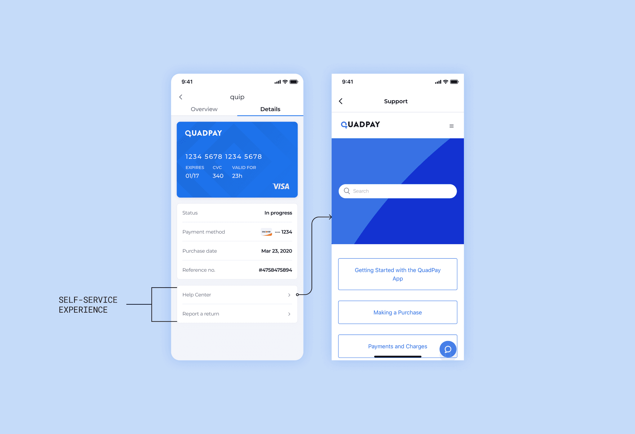
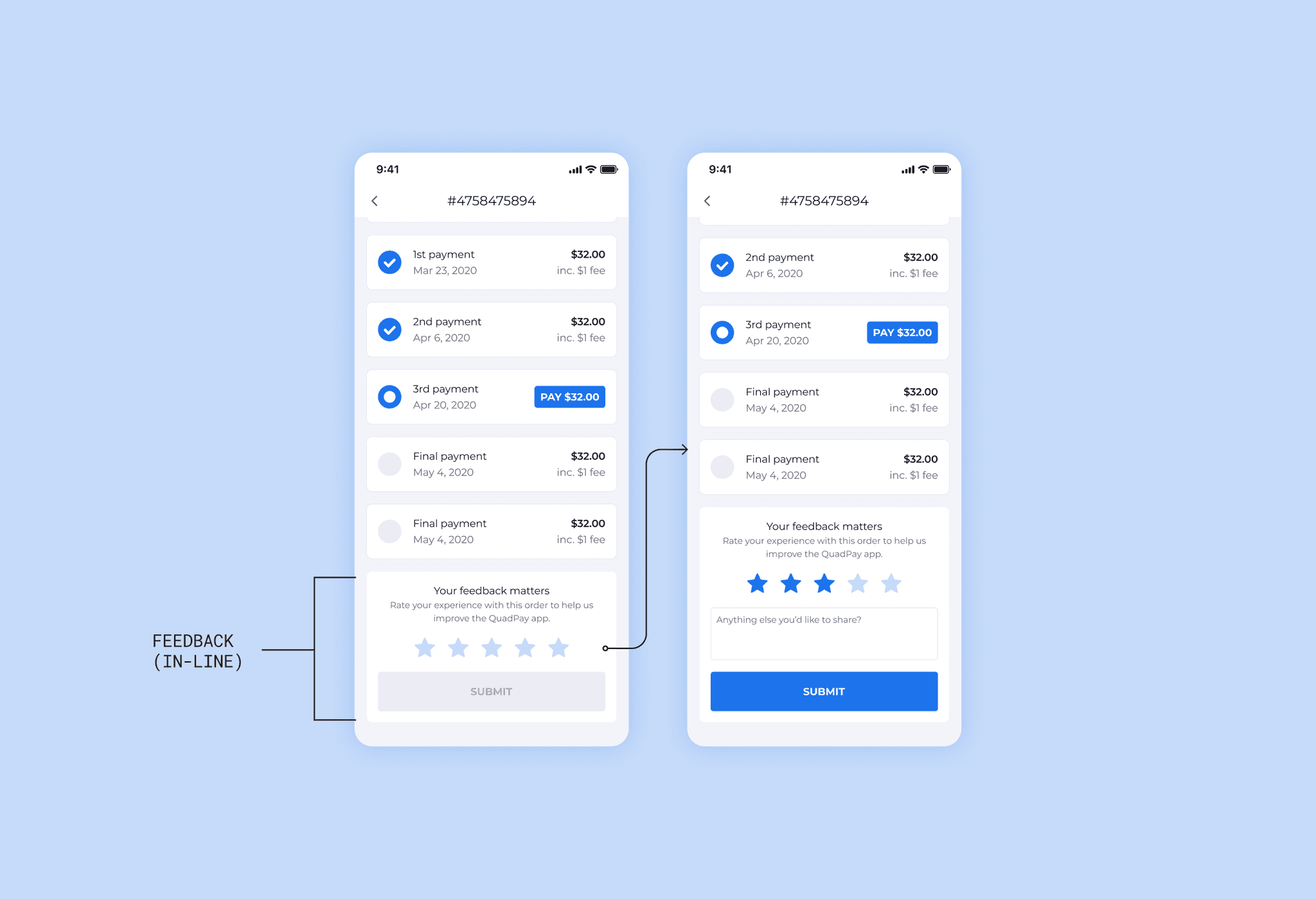
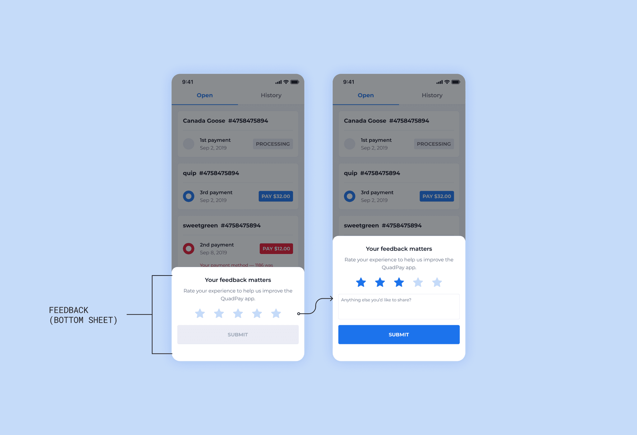
To improve in-app feedback, I developed three concepts. The first concept introduced self-service support links in the “Details” tab of the Order Details screen, allowing users to access the Help Center and report returns for unused virtual card balances or returned purchases. The second concept added a feedback component at the bottom of the Order Details screen, where users could rate their experience from 1-5 and provide additional comments, helping us gather insights to reduce support calls and improve the overall experience. The third concept used a feedback modal on the Orders screen to collect broader user feedback outside of specific orders. Given its higher friction, this modal would need to be deployed strategically and sparingly.
With fully realized concepts in hand, I conducted guerrilla testing with two small groups of people - one internal (comprised of a small group of people on our sales team) and one external (comprised of a small group of people who worked in our larger NYC office building). Several key takeaways emerged from the testing of the presented concepts.
The internal test group appreciated the visual changes to the orders card and the ability to self-service support requests from the “Orders Detail” screen. Meanwhile, the external test group gravitated more towards the contextual improvements to the order status on the order cards. There was also clear favor from both parties to incorporate merchant logos into the order cards, and the tab navigation in the “Order Details” screen proved popular, too.
Final Designs
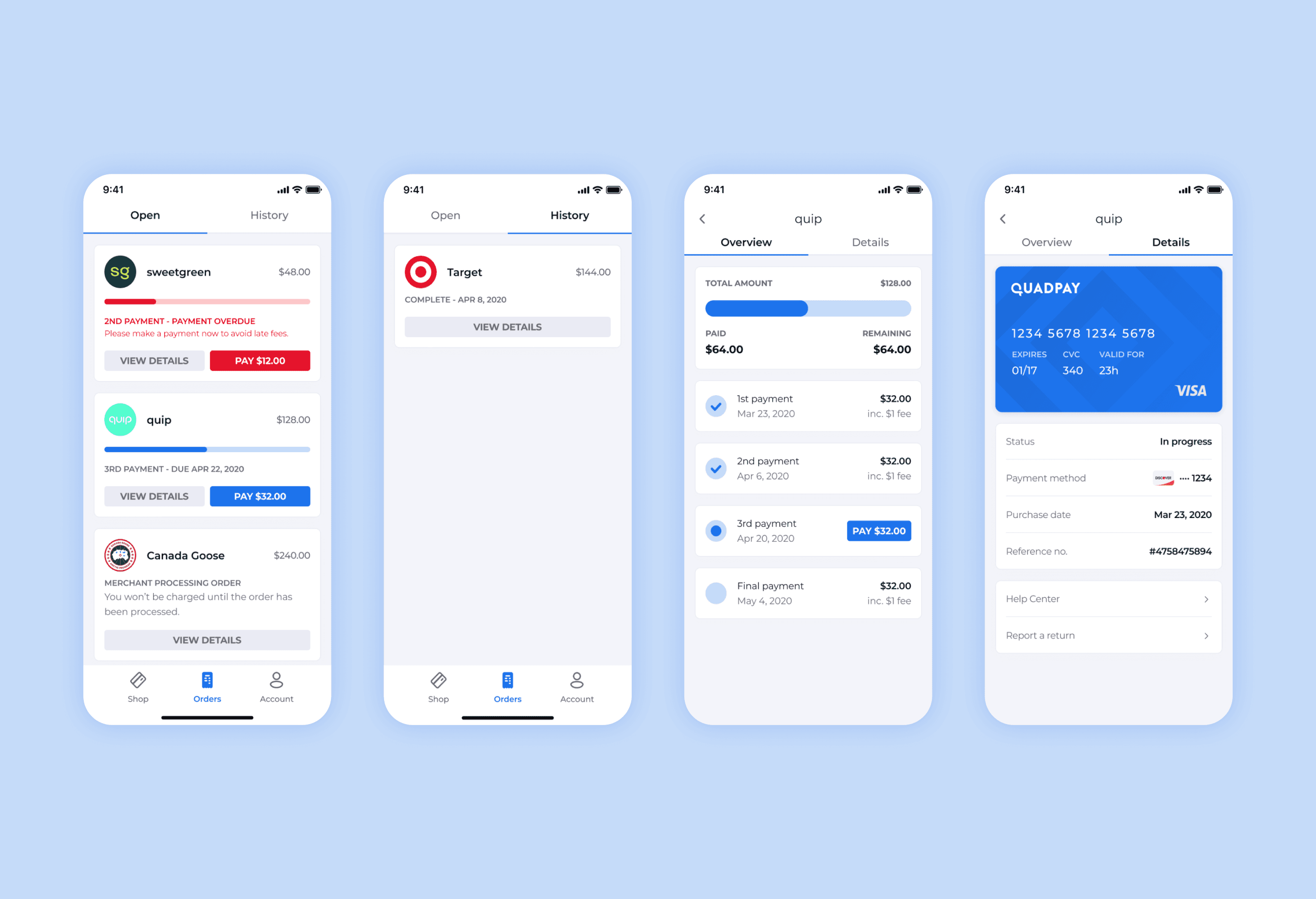
Based on the feedback gathered from testing, I designed a comprehensive concept that improved the flow between the "Orders" screen and the "Order Details" screen. I added merchant logos to the order cards on the "Orders" screen, enhanced order status comprehension with new subtitle verbiage and descriptive text, and incorporated a revised progress tracker akin to the one designed for the primary card on the “Order Details” screen. It was a no-brainer to keep the tab navigation system on the "Order Details" screen as well, as testers saw clear value in the information on the “Details” tab, especially with the self-service support links.
Final designs for the Orders index page and the Overview and Details pages.
I reviewed this new concept with the product manager and we determined the best approach to validation would be to A/B test the new flow with a sub-sect of our user base in-app.
Implementation
We presented the new concept to the engineering team to assess effort vs. impact and agree on a shippable solution. The main challenges were building the Details tab, creating the progress tracker, and incorporating merchant logos. The logos initially posed a blocker since we lacked a library, and the engineers suggested using icons instead to stay on schedule. I advocated for keeping the logos, as they were integral to the experience. To address this, we decided to phase the rollout, starting with the Details tab, followed by the progress tracker, and finally redesigning order cards with the logos. Fortunately, I coordinated with another team that had access to an API of merchant logos, which accelerated our timeline. After handing off the designs, we collaborated asynchronously via Figma, and I conducted visual QA to ensure everything was pixel-perfect before each phase was released in TestFlight.
Results
We began to gather feedback immediately upon rollout into the app. While we saw some initial trends begin to emerge with the introduction of the first phase of work, the changes made a much more significant impact once the entire redesign was completed. Referring back to our original “How might we statements”:
We saw a decrease in late payments quite quickly from the test group. This helped us keep on track with our yearly KPI to keep our delinquency rate below 5% each month.
Our analytics and customer experience teams found that a solid number of users were interacting with the new self-service links in the “Details” tab. We noted that we were maintaining a repeat customer rate above the 66% threshold we were aiming for within that group.
Over the course of several weeks, we also began to see a decline in customer support call volume as well. Along with that decrease, we saw fewer App Store reviews below four stars than in the months before.
Conclusion
Revamping QuadPay’s order management experience was a transformative project that not only improved user satisfaction but also delivered tangible business results. By implementing clearer visual cues, enhancing order status communication, and providing self-service options, we reduced customer support calls and late payments, while driving higher user engagement. The phased rollout allowed us to iteratively improve the design based on real-world feedback, resulting in a more streamlined and user-friendly interface.
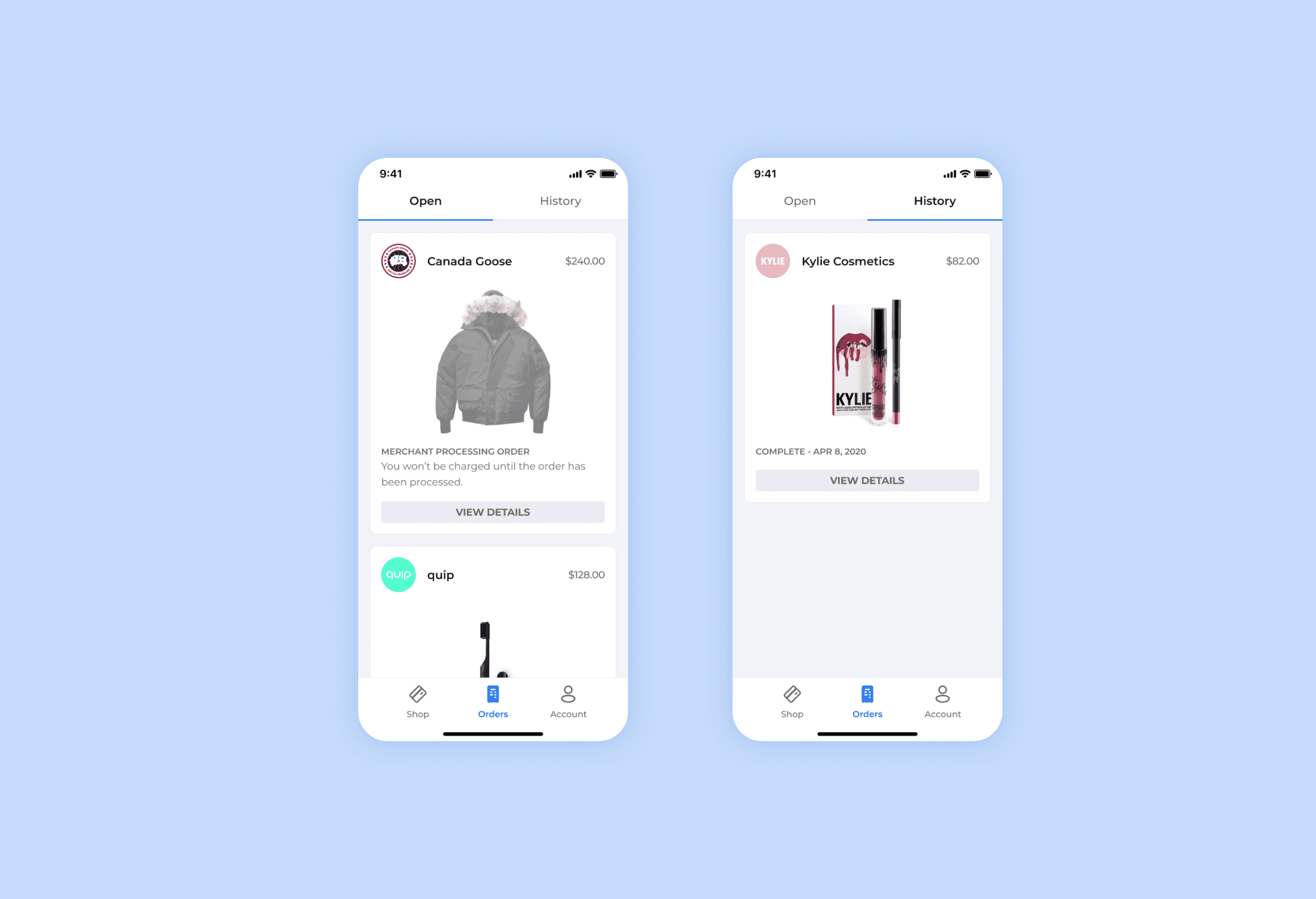
Additional designs created iteratively after we began to receive user feedback.
This project was a significant step in aligning the product with both user needs and business goals, ultimately supporting QuadPay’s rapid growth and improving the overall user experience for its 1.5 million users.
