Petal, 2022
Improving AutoPay UX
Enhancing autopay to make mobile credit payments faster and simpler.
Overview
My Role
Senior Product Designer
10 Weeks • Jan - Mar 2022
Collaborators
Product Designer, Product Manager, Analysts, Front-End Engineers
Wins
100% increase in adoption rate within the first month
4% increase in payment completion rates among beta testers
Systems-friendly solutions simplification of overused legacy components.
Long Story Short
Petal’s mission is to empower credit builders to manage their finances through user-friendly credit products. Payments were central to this platform, but as the products matured, so did the need for more effective solutions.
Leveraging in-app feedback, the Payments team identified key initiatives, including a redesigned AutoPay setup to enhance the user experience. The original flow had minimal design input and failed to address edge cases as the user base grew. The redesign introduced clearer labeling, simplified paths, and a more organized presentation.
The update established a clearer hierarchy, making it easier for users to discover and set up AutoPay. These improvements boosted feature adoption, reduced operational costs, and advanced Petal’s financial goals.
Prototype
Process
Objective
Improving AutoPay was a top priority for the Payments team in 2022 after the product manager and myself noticed an increase in negative AutoPay feedback. The existing logic was confusing, making it difficult for users to understand when their AutoPay payments were successful. Additionally, around 25% of Petal's users relied on AutoPay to make their minimum payment, but this figure had remained stagnant over the last few quarters. Improving this experience stood to help our team meet the company’s top OKRs for the year, which were to achieve sustainable unit economics by enhancing revenue generation relative to production and delivery costs and maintaining a delinquency rate below 3%.
Requirements
We planned to measure success using the current-to-30-days past due rate, which measured the ratio of users who were current on payments to those more than 30 days overdue. The target was to keep this rate below 3%, and the focus was on enhancing the AutoPay experience to potentially increase the number of users with up-to-date accounts. With these metrics in mind, we found our guiding principle using a “How might we…” statement:
How might we streamline the AutoPay feature and make it more user-friendly in order to increase its adoption rate and reduce delinquencies?
With these requirements in mind, I needed to assess where our current UX falls short. I had three key questions jumping into this project:
What are our users’ current frustrations and pain points?
What do users want out of this experience?
What do users really need?
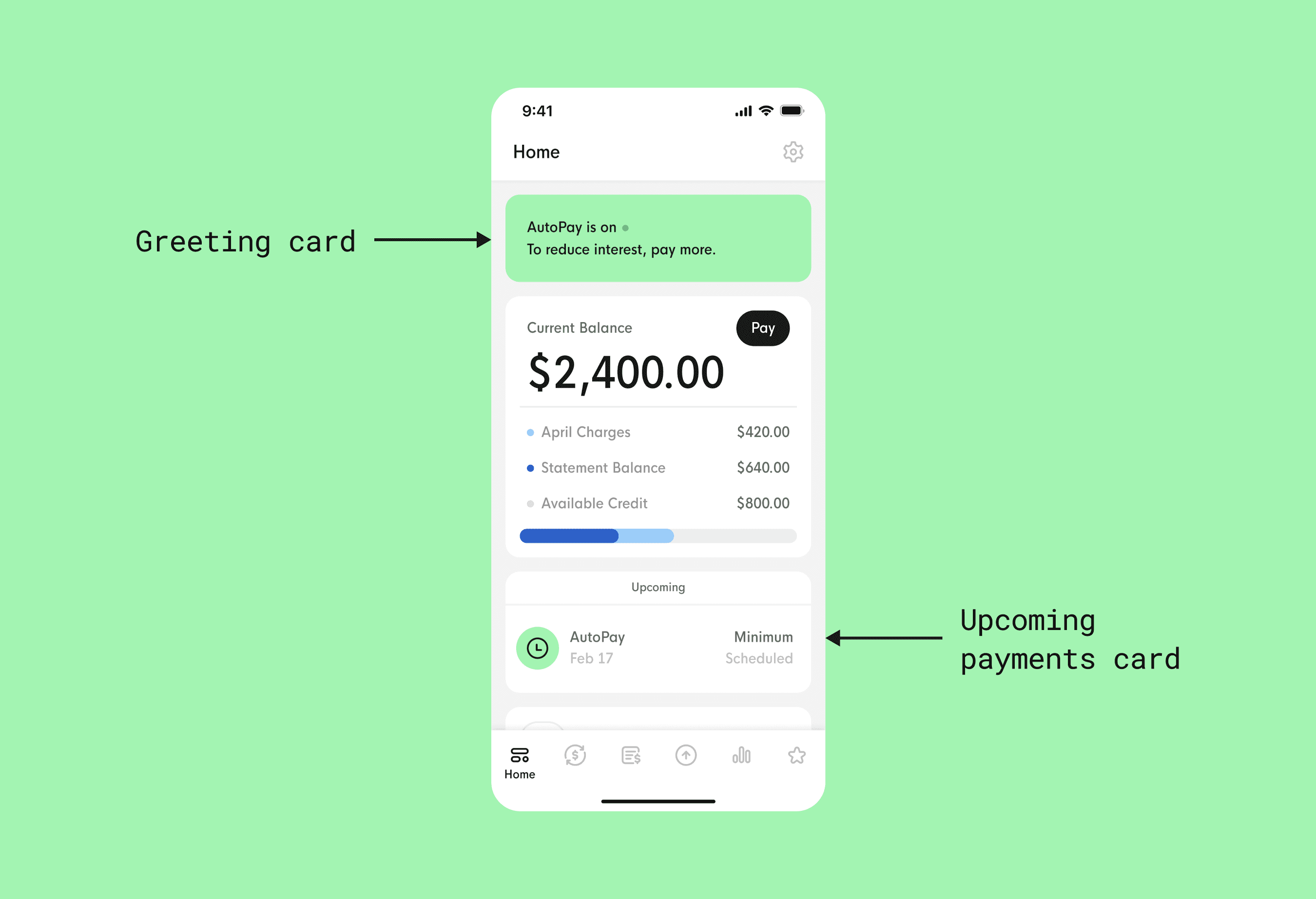
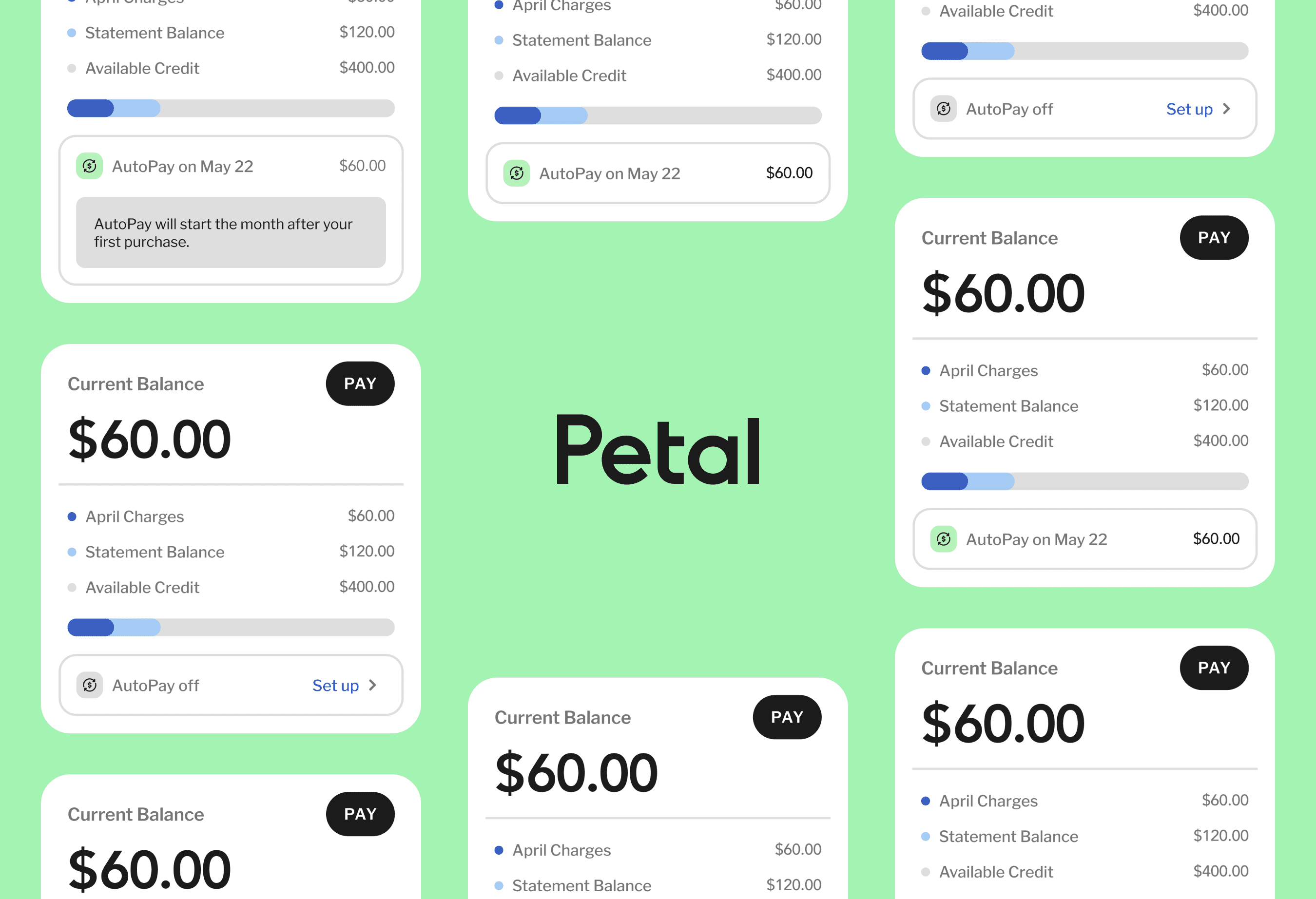
Existing AutoPay UX in the Petal app.
Looking at the current UX, we were using a series of greeting cards on the Home page to let users know if their AutoPay is on or off. This component was part of a larger set of account status notifications we implemented, but as we were adding more cards, they were starting to overlap with each other, causing confusion for users and stifling our ability to design more intuitive features.
We also show all scheduled AutoPay payments on the Upcoming payments section below the current balance card on the Home page, which felt repetitive, and caused confusion because there was no one clear source of truth for the AutoPay information. This also disrupted the flow of the Home page, so I knew I needed to figure out a new way to better convey this information without affecting the users’ ability to navigate information efficiently.
Research
As part of my role, I led the research efforts, focusing on three key areas. First, I analyzed AutoPay trends from the Consumer Financial Protection Bureau (CFPB) report to understand the landscape and areas for improvement. I then conducted a competitive SWOT analysis of the Apple Wallet app to identify opportunities for our AutoPay feature. Finally, I gathered critical user feedback from our in-app micro-service to understand how users interact with AutoPay and identify pain points. This research provided valuable insights to improve our AutoPay feature and better meet user needs.
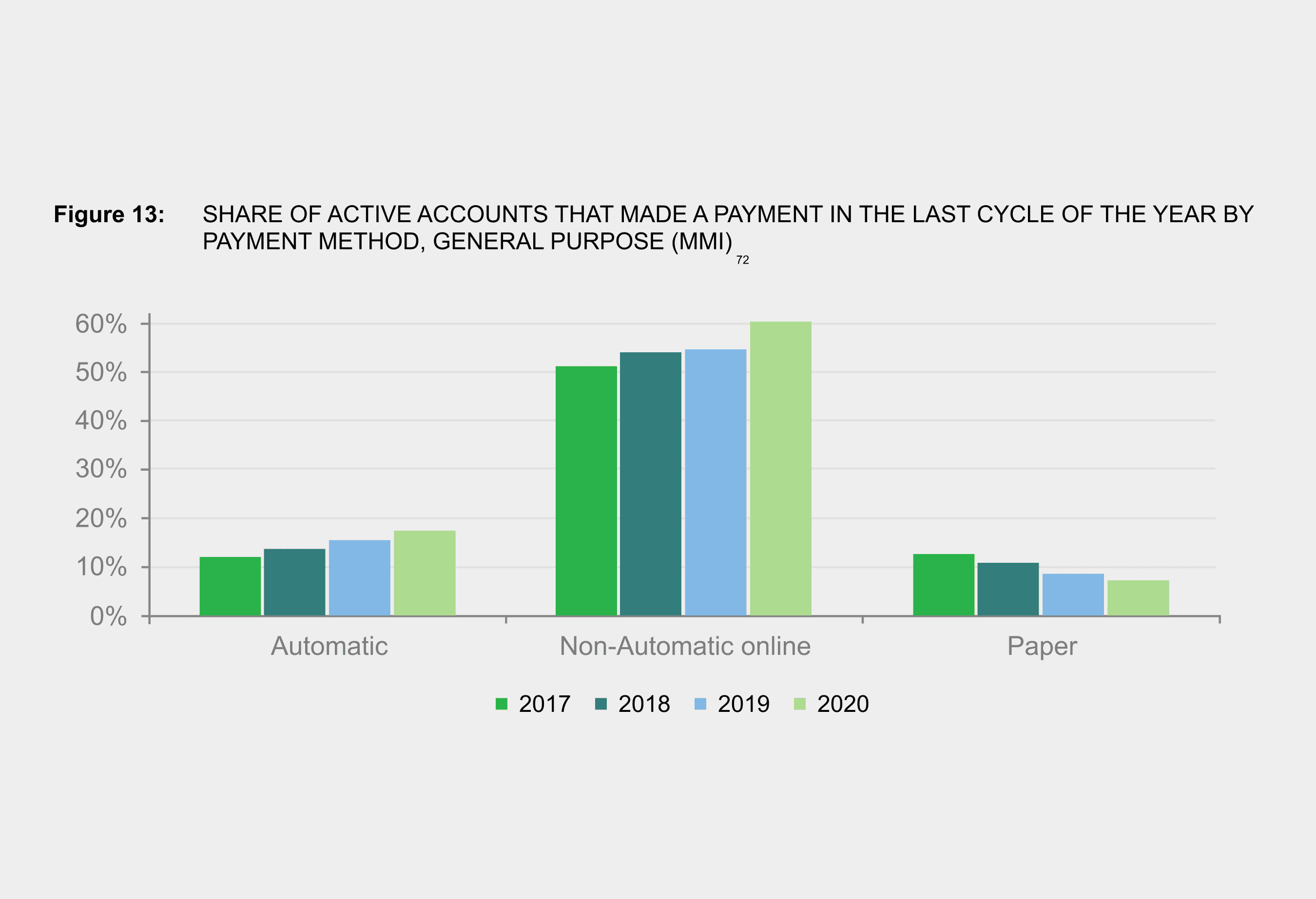
CFPB figure showing trends in consumer credit account payment methods from 2017 to 2020.
The trends I found identified in the CFPB 2021 market report showed me promising results that reinforced our assumptions about AutoPay. Overall, the number of people who set up automatic payments on their credit card accounts is increasing. From 2017 to 2020, the amount of consumers who paid with AutoPay rose from about 11% to nearly 20%. Most of these consumers were between 25 to 64 years old - right within the age range of our typical users. However, the report also found that while automatic payment rates are increasing, many consumers still want to maintain manual controls like setting varying payment amounts or checking their statements first.
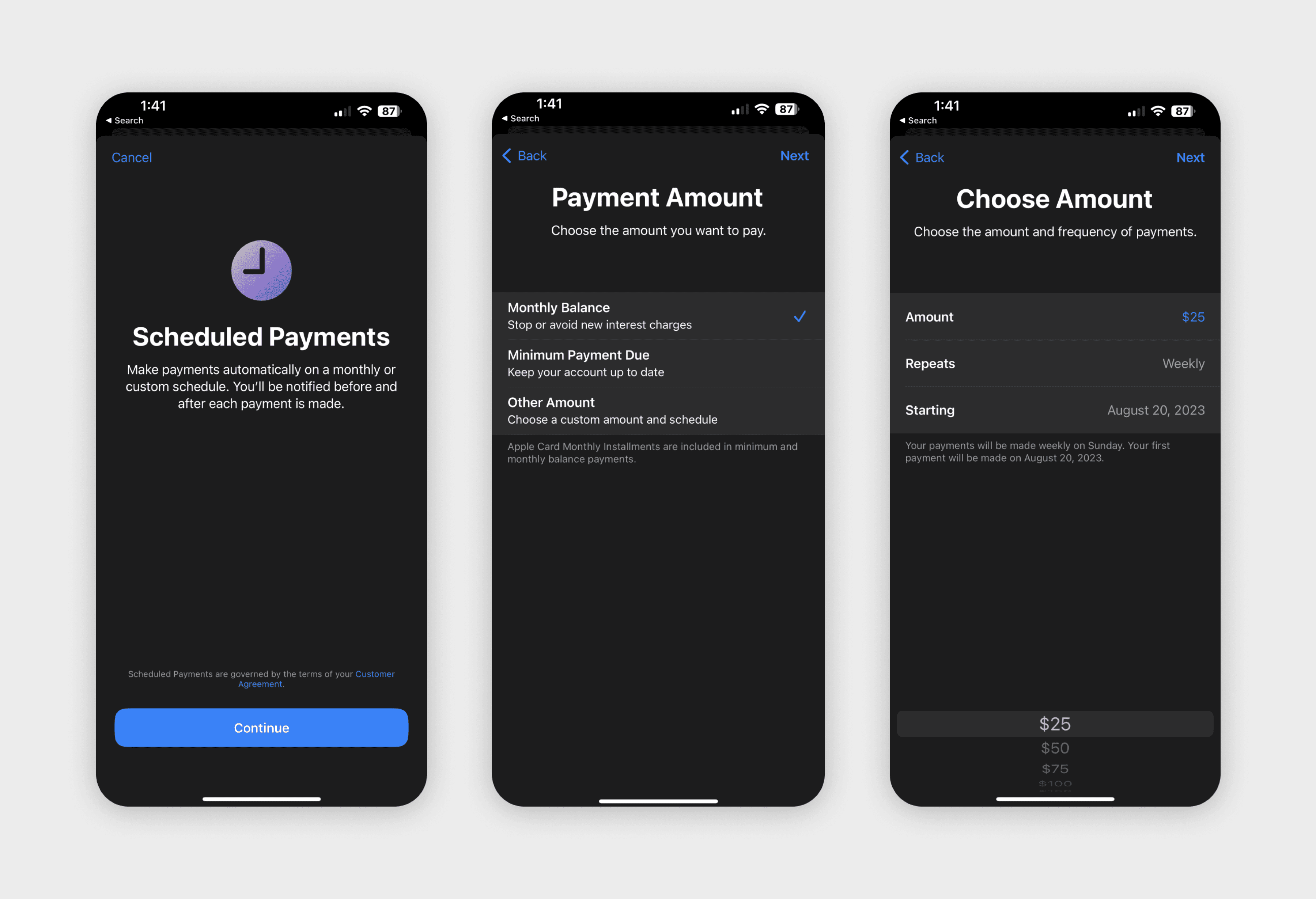
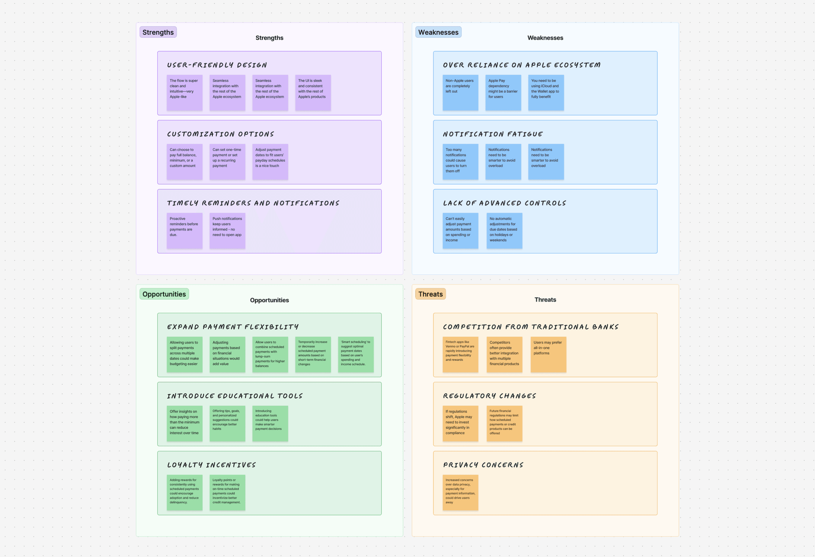
Apple Wallet scheduled payment flow documented for SWOT analysis.
Next, I conducted a SWOT analysis of the Apple Wallet app with the product manager and another designer to explore its strengths, weaknesses, opportunities, and threats to highlight both the advantages and potential areas for improvement. By diving deep into a competitors’ offerings and looking at external factors, I was able to gather insights that could inform potential improvements and optimizations for our AutoPay experience.
A glimpse at segmented AutoPay feedback collected in our user insights hub.
The SWOT analysis revealed that Apple Wallet’s scheduled payments excel in user-friendly design, seamless integration with the Apple ecosystem, and timely reminders, boosting user confidence in managing payments. However, its limited flexibility and reliance on the Apple ecosystem present challenges compared to competitors. Opportunities include expanding flexibility, adding educational tools, and integrating with third-party apps, while threats from traditional banks, fintechs, and evolving regulations were key concerns. This analysis offered a comprehensive view, helping shape strategies to enhance and differentiate Petal’s AutoPay offering.
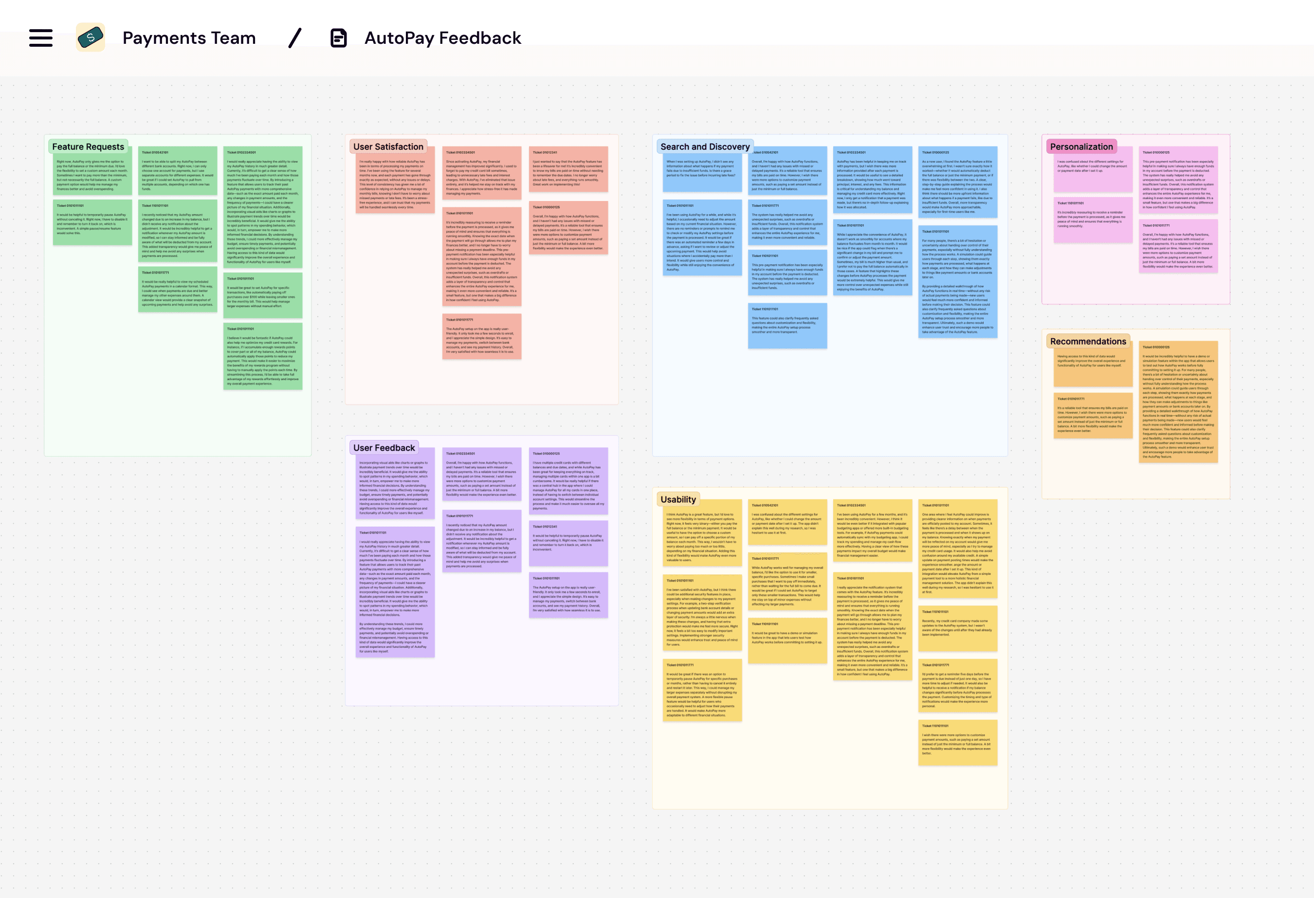
A glimpse at segmented AutoPay feedback collected in our user insights hub.
In the end though, the most valuable insights came from our own users. We have an in-app feedback service where users share what’s working and what isn’t, which feeds into a micro-service that allows us to filter feedback by feature. Over the past year, I collected dozens of individual pieces of feedback specific to AutoPay. While there’s more to discuss later, even during the initial compilation, it was evident that many users were critical of AutoPay’s performance.
Strategy
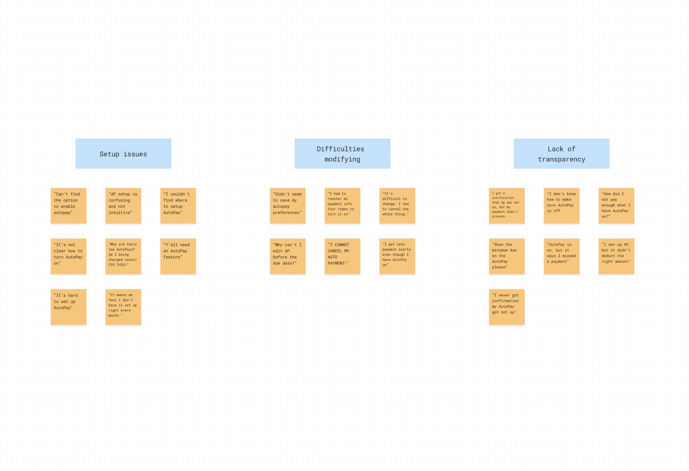
After gathering information, I created a strategy that clearly identified our users’ pain points, wants, and needs to our management team to earn their support. I started by creating an affinity map of all the user feedback we collected. This allowed us to point to trends we were seeing in the app.
Final designs for the Orders index page and the Overview and Details pages.
I compiled dozens of submissions of feedback on AutoPay within the last year on a FigJam board. The biggest takeaway I found was that setting up AutoPay was just point-blank difficult. Many users did not know how to set it up and did not know that they had to go to the Settings page to do so.
For those who did have AutoPay set up, their biggest gripe was that it was difficult to modify an existing AutoPay plan. Despite calling out the status and schedule on the Home page, it wasn’t clear that users still had to go back to Settings to adjust the plan.
Lastly, it was clear from our feedback that despite calling out the scheduled AutoPay payments in the Upcoming payments card on the Home page, a lot of users did not realize this existed. Again, we hypothesized that this confusion was due to the different sections on the Home page.
Final designs for the Orders index page and the Overview and Details pages.
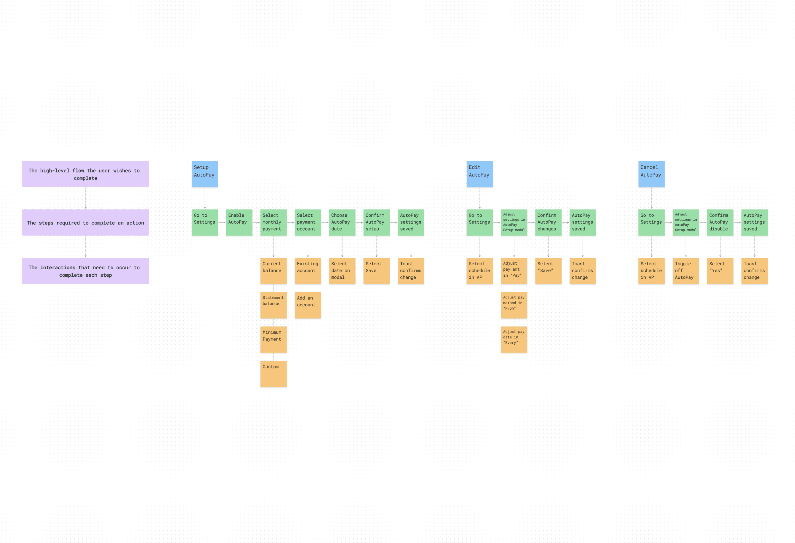
I also formed a Customer Journey Map of our existing AutoPay flow to plot where we found gaps and inefficiencies as well as to capture the areas that we wanted to focus on to take this feature to the next level.
I regrouped with the product manager to put together some key takeaways to present to our stakeholders.
We agreed that it was time to pull the AutoPay interactions out of the Settings page. This flow was too vague for most users and led to the majority of problems they were having with the feature.
Next, since we already display AutoPay status on the Home page, then users should have the flexibility to set it up, modify it, and cancel it from there too.
Last, We needed to get the message across clearly. Having two points of AutoPay status on the Home page competed for attention, so we need to decide on a singular approach.
Ideation
Our takeaways were met with a positive reaction from leadership, and we were given the go-ahead to start ideating. I met with the product manager and the front-end engineer on her team to scope out work on the AutoPay feature. We agreed it was important to maintain consistency with our existing visual design language to ensure a seamless user experience and prevent confusion. We also discussed the potential to leverage our existing design system components to speed up development and ensure consistency across the app. Finally, we talked about the importance of ensuring that the solution can scale to the web since some users manage their payments through our website.
With the full team in alignment, I began working on new concepts. As I considered the approach we agreed on, I opted to begin my designs in high fidelity as it was the most efficient way for me to explore different solutions for the AutoPay feature on the Home page.
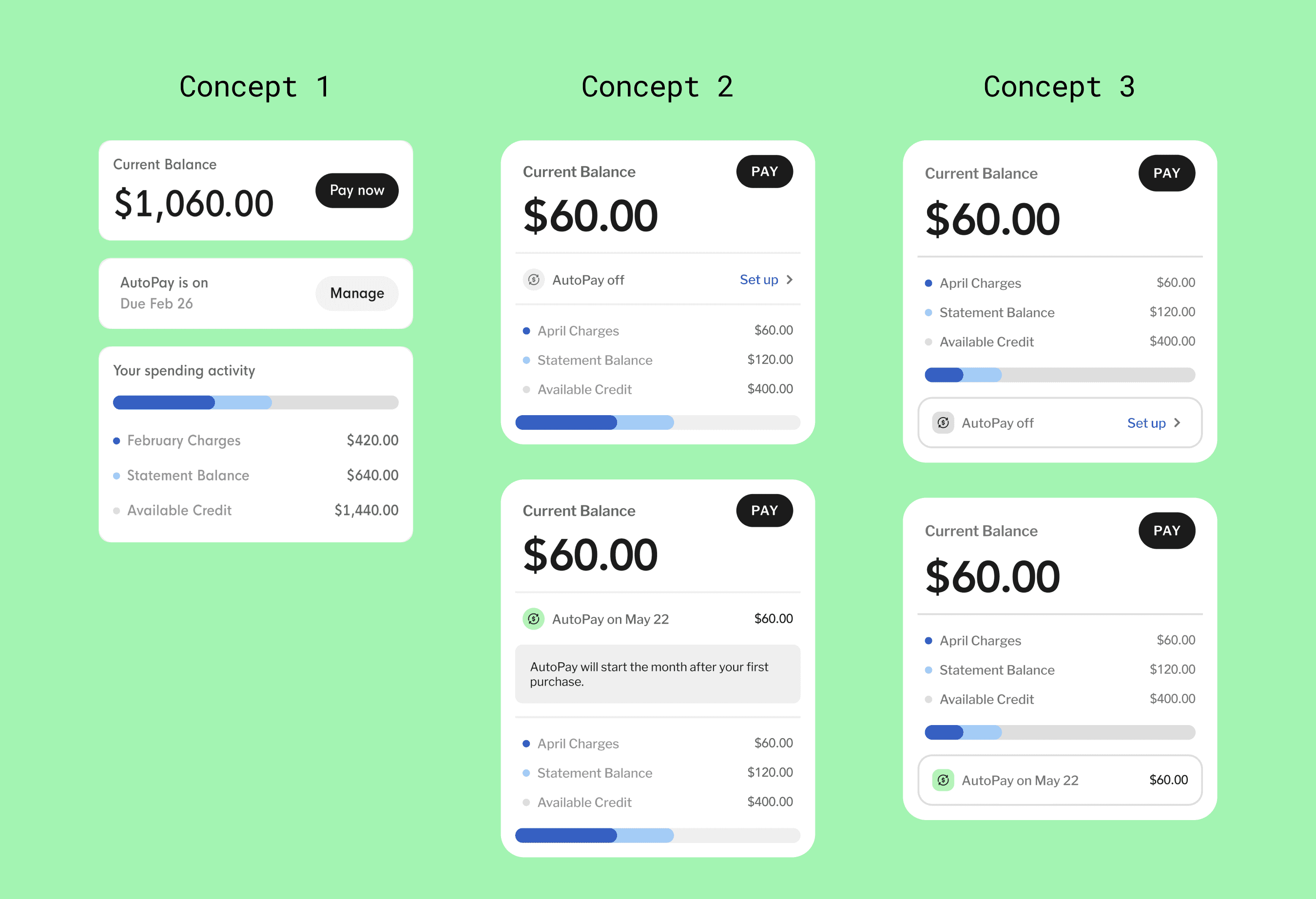
Three different concepts created to solve for AutoPay UX issues.
Concept 1
Break the card into multiple components
Concept 2
Use divider lines to fold the feature into the middle of the card
Concept 3
Nestle the feature into a box at the bottom of the card
Iteration
When I presented my concepts to the product manager and engineer, Concept 3 stood out among the other options. It presented the best opportunity to remove the current greeting cards by folding AutoPay into the Current Balance card.
As I suspected, Concept 1 was too ambitious for our current timeline at this point, but we made note to reconsider it next quarter during our roadmap planning. As for Concept 2, the product manager shared my concerns about losing the AutoPay feature if we put it between the Current Balance and Spending Activity.
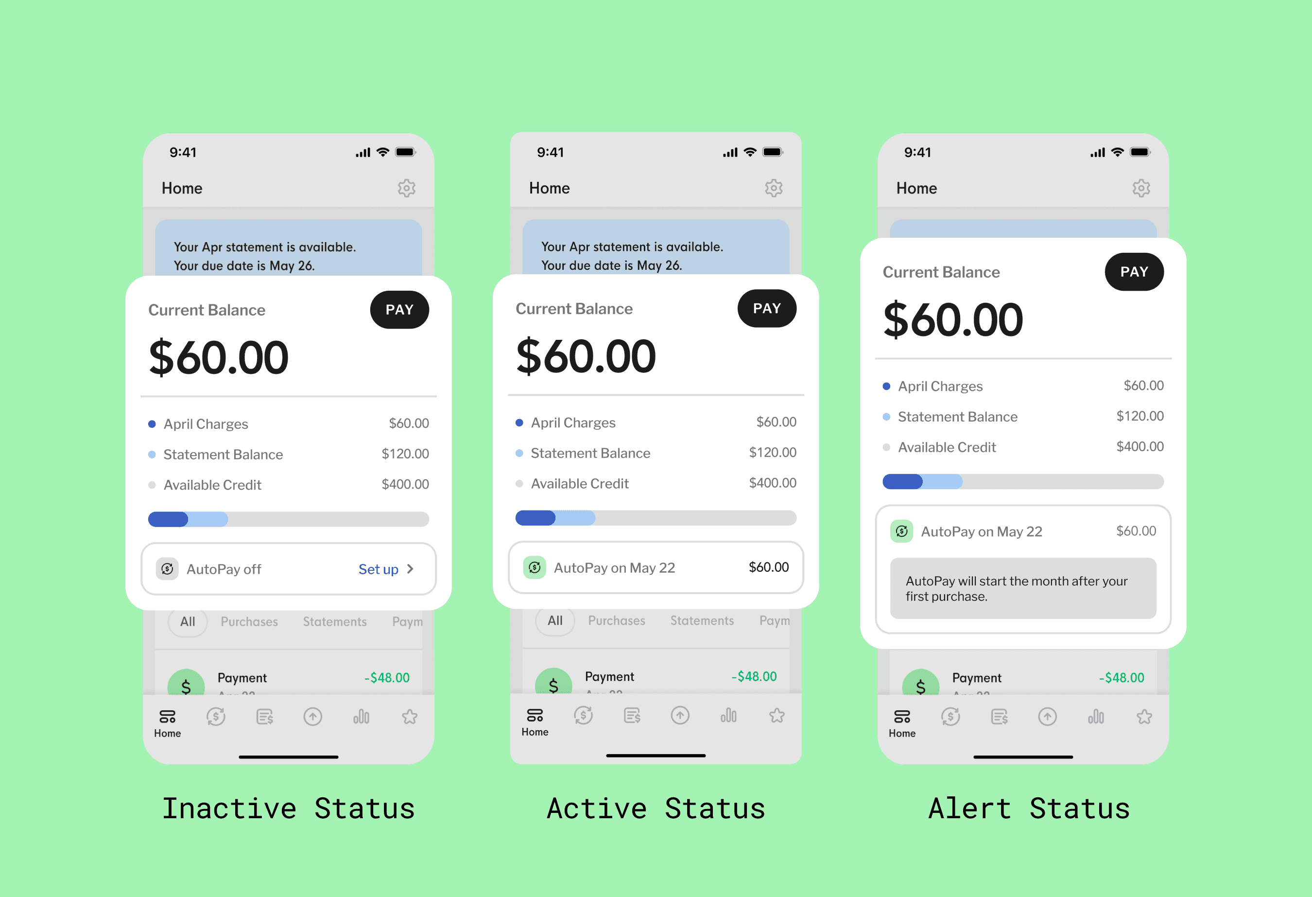
Three different concepts created to solve for AutoPay UX issues.
Inactive Status (Default)
AutoPay has not been enabled by the user.
Active Status
AutoPay has been enabled by the user.
Alert Status
AutoPay is enabled, but is affected by a secondary account status.
Now that we knew which concept we were going to test, I continued to build out the parts of the experience that would need to be redesigned. This included points of setting up, managing, and canceling an AutoPay plan as well as applying some additional visual touch-ups.
Implementation
Handing off files to our engineer was a seamless experience as he had already been coordinating with us throughout the project. We largely communicated asynchronously, save for working together to create a map documenting specific edge-case messaging to display to users depending on the status of their AutoPay plan.
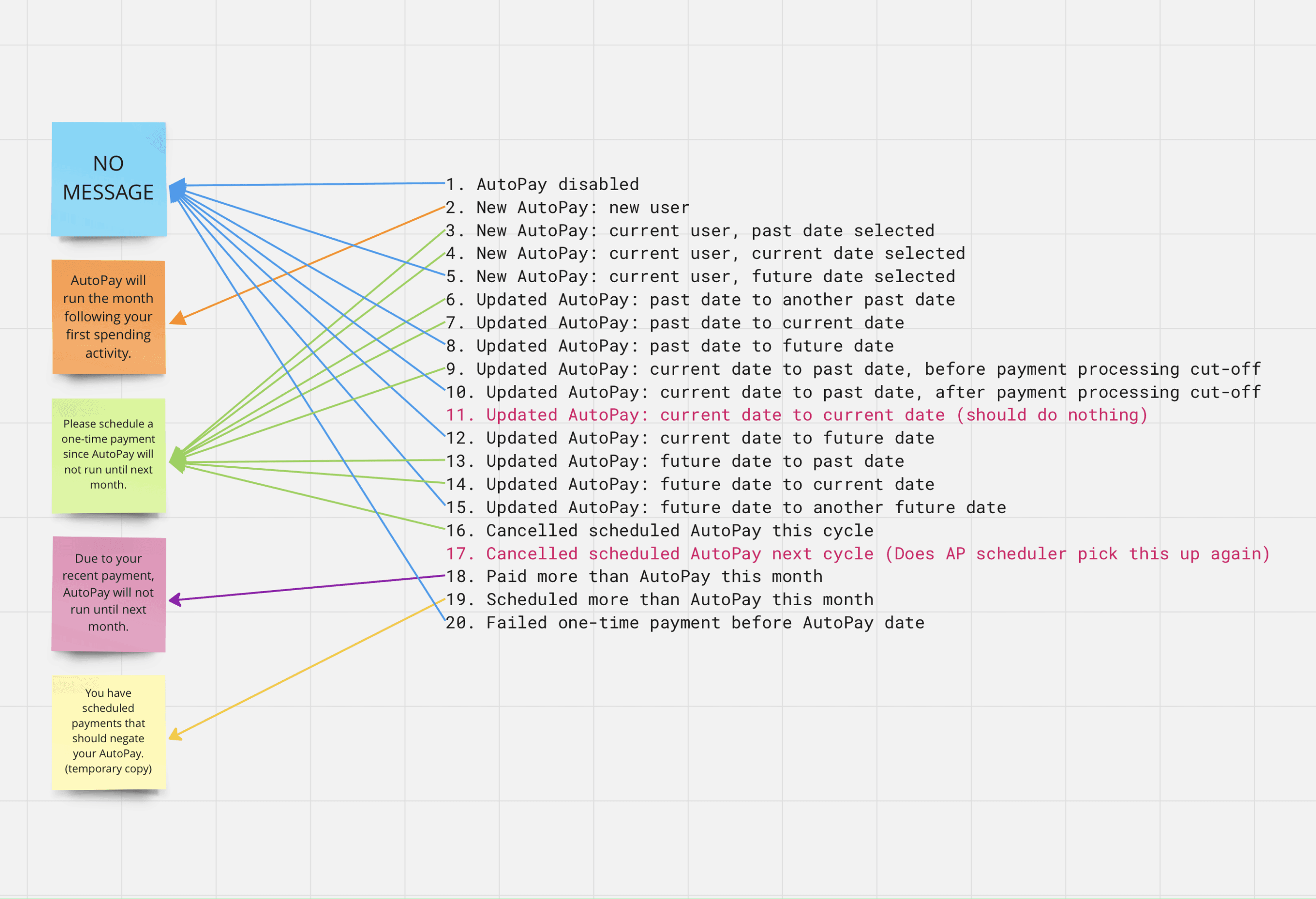
The engineer and I mapped out edge-case messaging based on users’ AutoPay status.
We launched the new experience into the app via a feature flag that we first tested internally with our test credit cards. As with most new feature launches, we typically asked coworkers to volunteer time to scrub for bugs before we would push live. After fixing any bugs in the code, we pushed the new experience live to 5% of our user base to test against our current experience.
Results
Within three months, we gathered feedback indicating that the new AutoPay experience was a success.
Enrollment in AutoPay for the test group increased by 12%. This increase suggests that the new design made it more convenient for users to locate and enable AutoPay.
The payment completion rate increased by 4%. We expected to see this number increase, especially in conjunction with the AutoPay enrollment increase as our typical AutoPay user completes most payments on time. This result directly helped us keep our past-due rate below 3%.
The number of customer support calls related to payment issues also decreased within this time period.
Conclusion
In conclusion, the AutoPay redesign showcased our team’s strong collaboration, clear communication, and user-centered approach. Through thorough research, strategic planning, and creative problem-solving, we simplified a complex process, resulting in increased AutoPay usage and payment completions. By addressing user pain points, we achieved our goals while demonstrating the impact of user-centered design on key company objectives.