Perry Street Software, 2023
Building New Chat Features
As a Senior Product Designer at Perry Street Software, I spearheaded a major initiative to enhance the chat experience across SCRUFF and Jack’d, the company’s two largest dating platforms. This case study highlights our strategic effort to modernize chat functionality for over 40 million users, focusing on delivering visual upgrades and introducing the first new features into the products in more than a year.
Role
SKills
Wins
Senior Product Designer
UX Strategy, Research, User Interface, Design Systems, Prototyping
⬆️ 5% MAU increase over first month
⬆️ 10% boost in revenue
Objective
Starting with a clear vision, I collaborated with the product manager to prioritize features on our board. I implemented a methodical approach to deliver feature updates efficiently, starting with read receipts (a highly requested feature), ensuring timely progress for our team without overwhelming the engineers.
Existing Chat UI framework
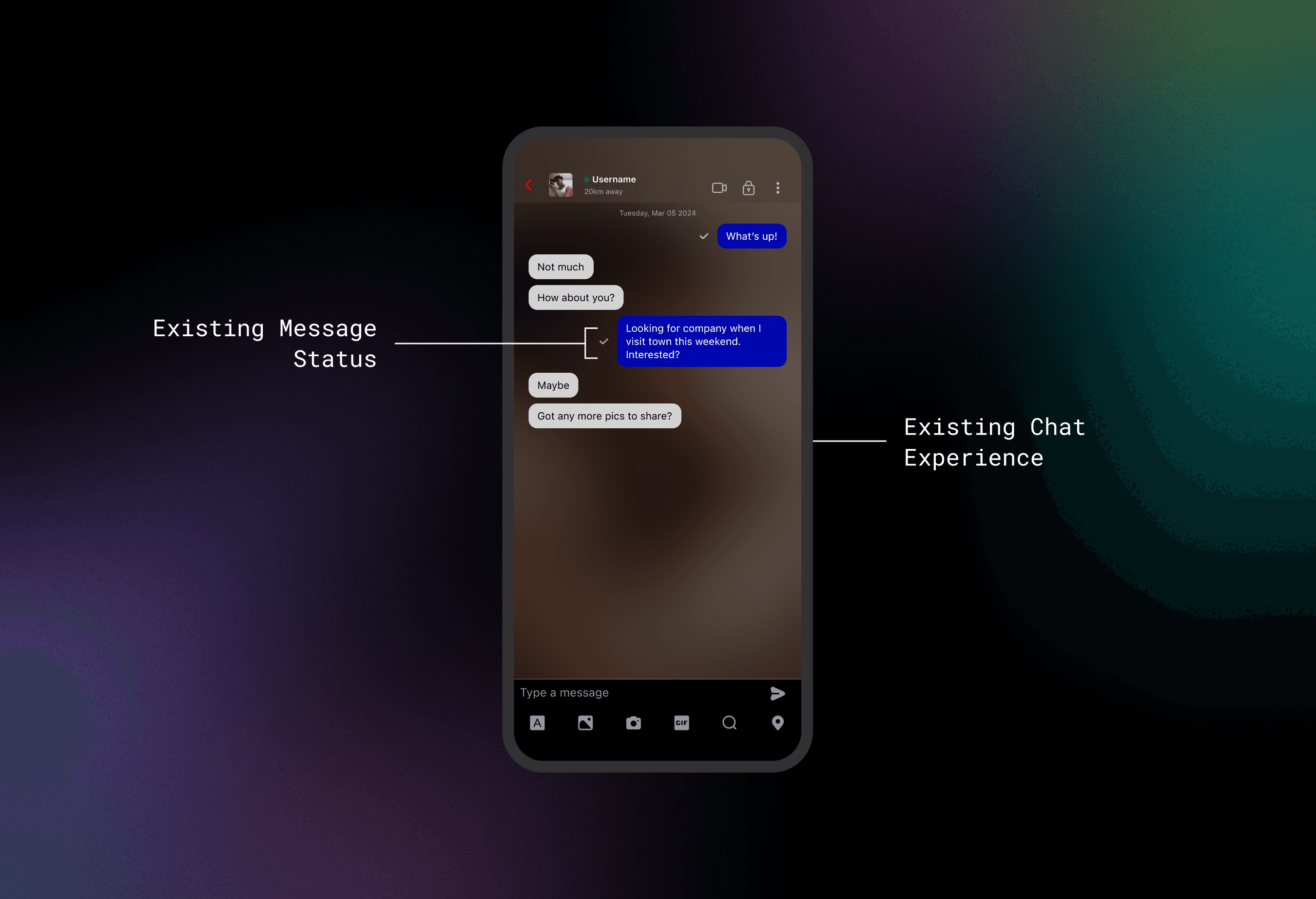
At the time, the only message status indicator in the chat experience was a checkmark next to the chat bubble indication that a message had been sent to the other user. Introducing read receipts would stand to help us improve user engagement, position us more competitively among similar apps, bring in revenue, and increase user satisfaction and retention, all benchmarks that were key companywide objectives.
Research
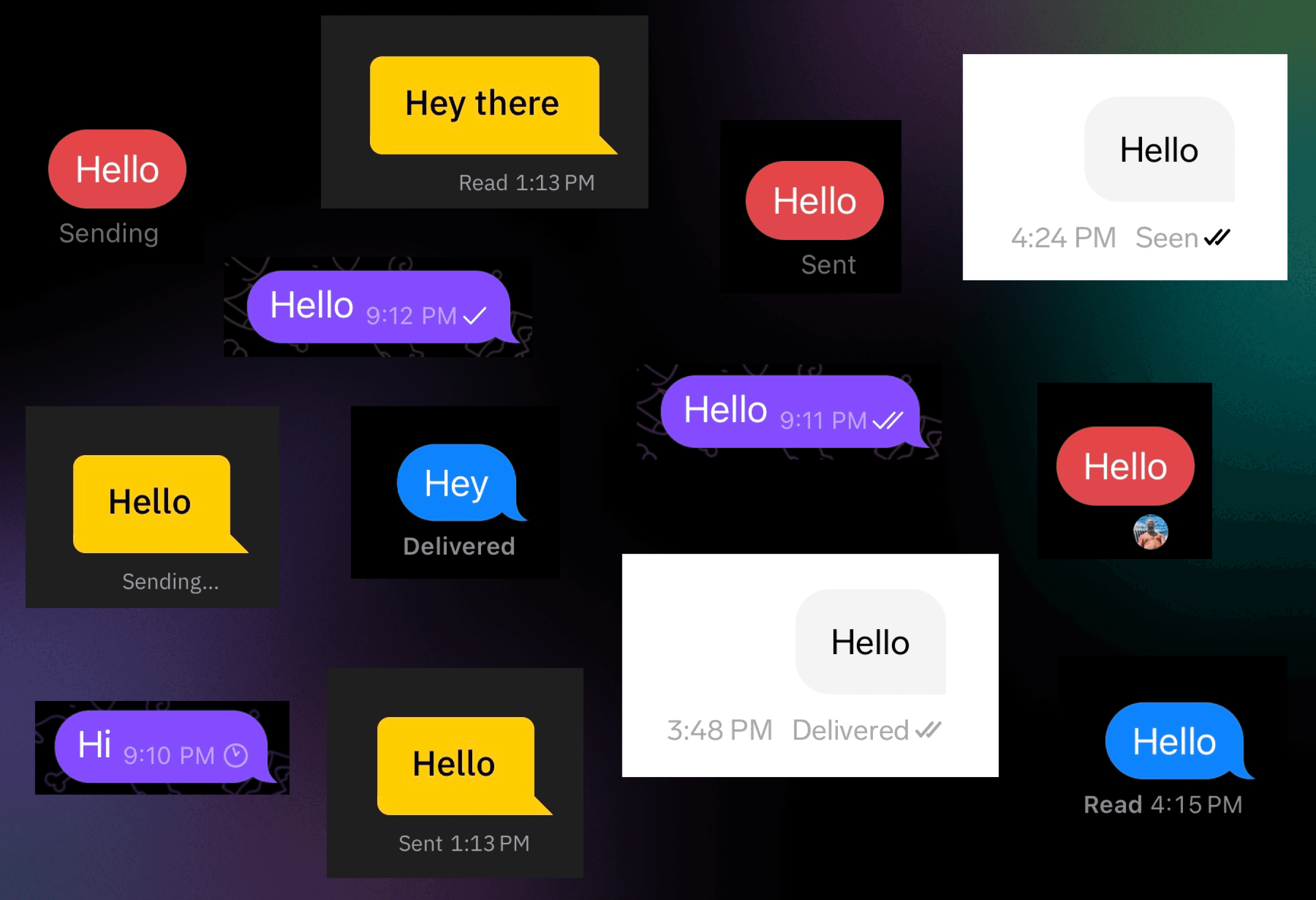
Understanding the potential impact of read receipts on user engagement and revenue, I conducted a thorough competitive analysis across dating and messaging apps. This analysis informed my decisions on the various states (Sending, Sent, Delivered, Read) and visual treatments (icon vs. text statuses) to implement.
Collection of message bubble styles taken from competitive analysis of Messenger, iMessage, Grindr, WhatsApp and Feeld.
Testing
Having gathered some insights, I crafted a comprehensive testing plan focused on how read receipts might impact privacy, comfort, and safety —particularly given our app’s mission toward inclusive and provide a safe space for queer people. I emphasized the importance of understanding user perceptions, customization needs, and potential risks, especially for our diverse audience. The lead on my team preferred a simplified, MVP approach focused on basic usability, however I pushed hard for deeper insights, stressing that these nuances could significantly shape user experience and trust.
Ultimately, we found common ground by making read receipts a premium feature, requiring users to pay to use it, and thus adding a layer of protection against bad actors. I retained my full test plan for future use, committed to refining this feature with user-centric insights as soon as we gather real data post-launch.
My streamlined user tests gauged sentiment and usability, to ensure that our feature met the nuanced needs of our users. My goal was to leverage users’ perceptions surrounding read receipts to uncover potential revenue opportunities while also uncovering how well they interpreted their meaning.
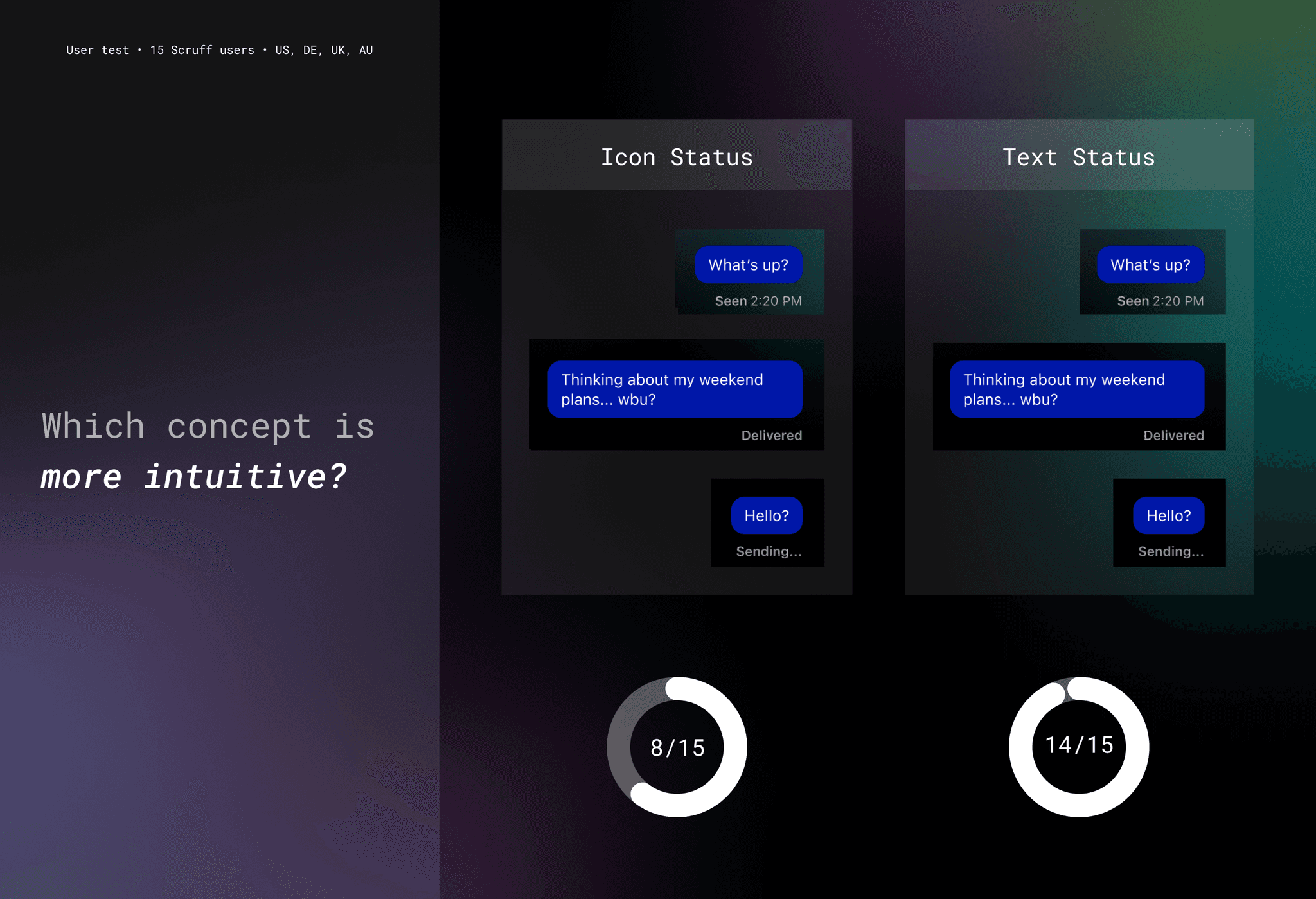
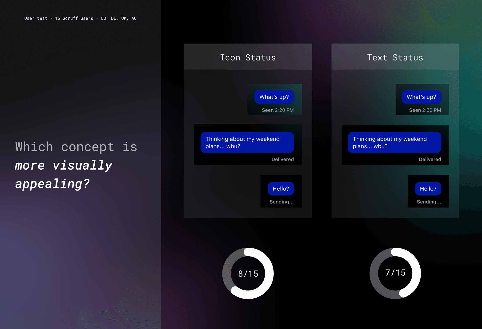
Results of three different user tests that helped drive decision making forward.
The testers generally viewed read receipts in a dating app positively. Most appreciated the feature and felt it influenced their engagement with messages. There was a preference for either having the feature on by default or customizable, with some expressing interest in trying a PRO version of the app if it included read receipts. Reactions to seeing a read message without a reply varied, but the majority were excited by the possibility of trying out the feature.
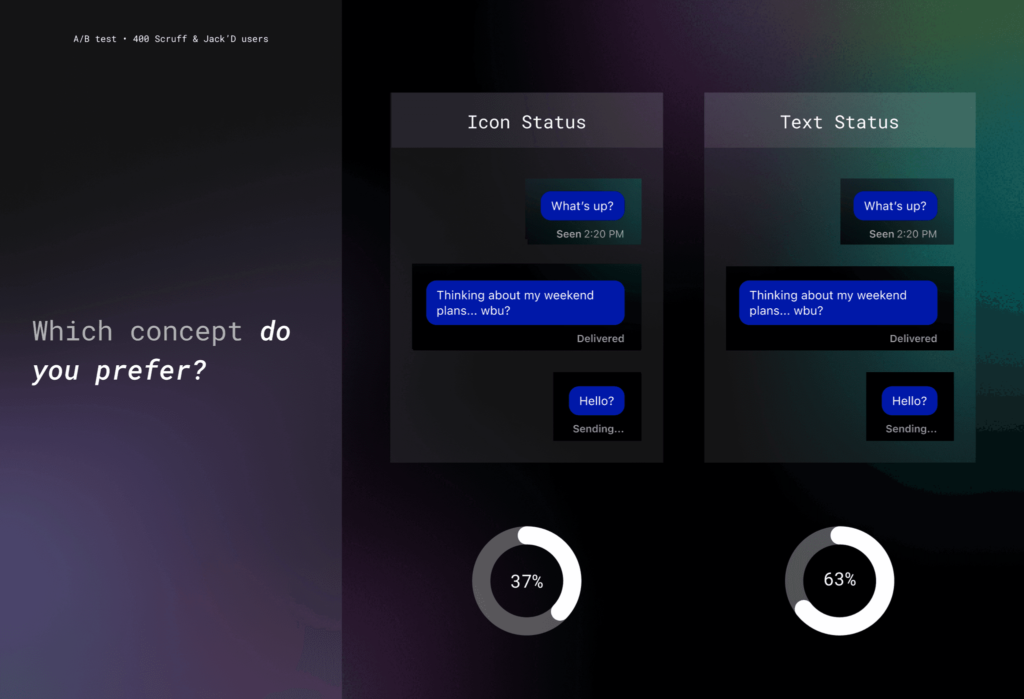
The visual test I ran provided mixed results. Although more users understood text-based read receipt statuses, icon based statuses proved to be a more popular choice. I followed up by conducting an additional A/B test to confirm a direction forward. I gathered 400 responses in our apps which guided me to a hybrid solution combining both icon and text statuses.
Ideation
With a solid understanding of the requirements, I moved forward with sketching out the read receipt states. I thoroughly analyzed our existing framework, mapping out the message’s journey from draft to execution, as well as an error state to address potential delivery issues. Competitors often use a four-state process (sending, sent, delivered, read), but our framework supported only three states (sending, sent, read). I assessed the need for a ‘delivered’ state and, after a strategic discussion with the product manager, determined that it was not critical. Implementing it would have required an extensive overhaul of our messaging infrastructure, with minimal user impact, so we prioritized efficiency and functionality.
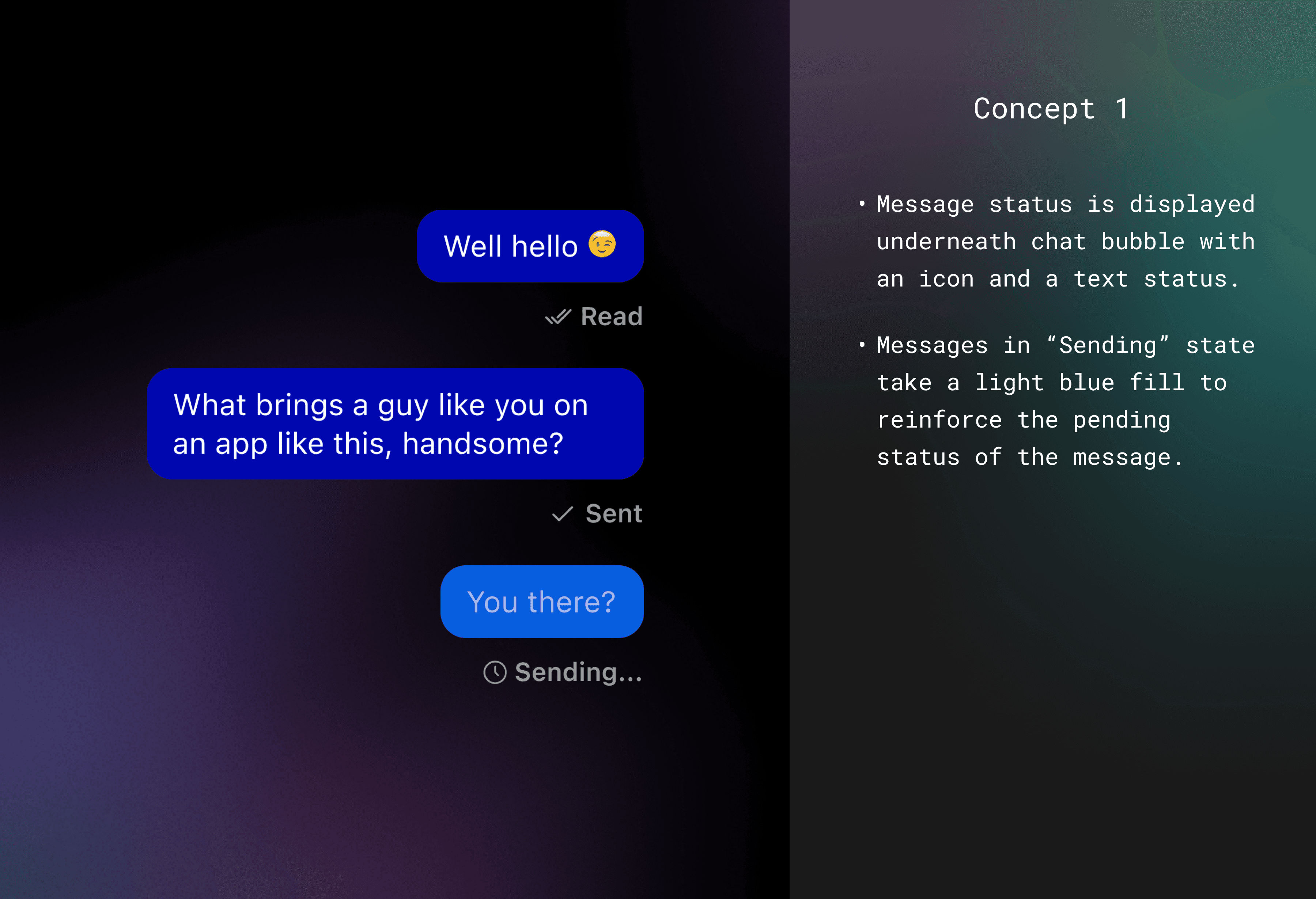
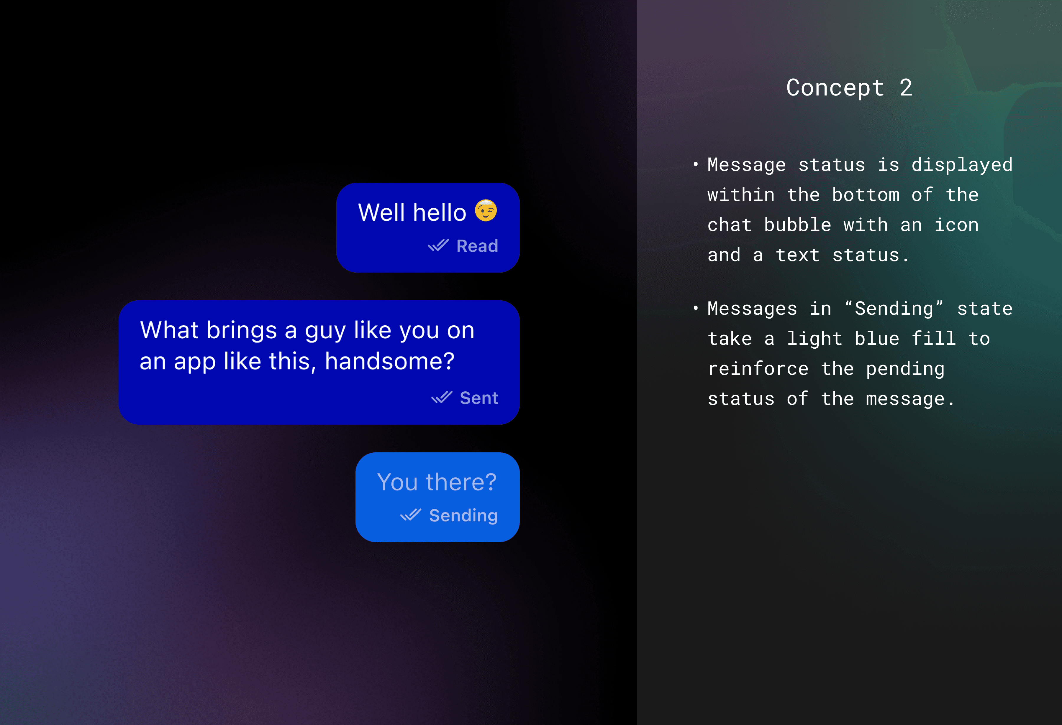
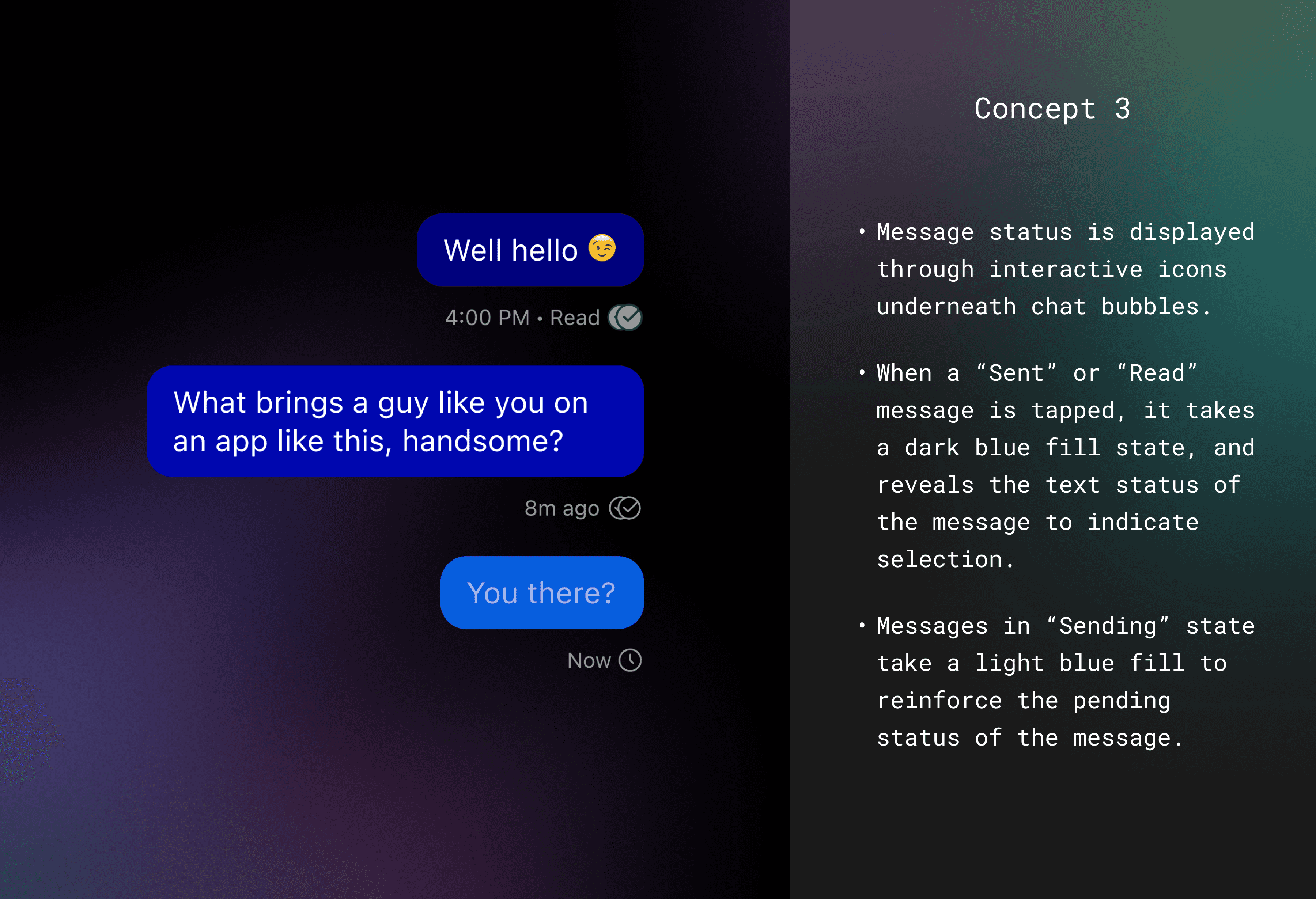
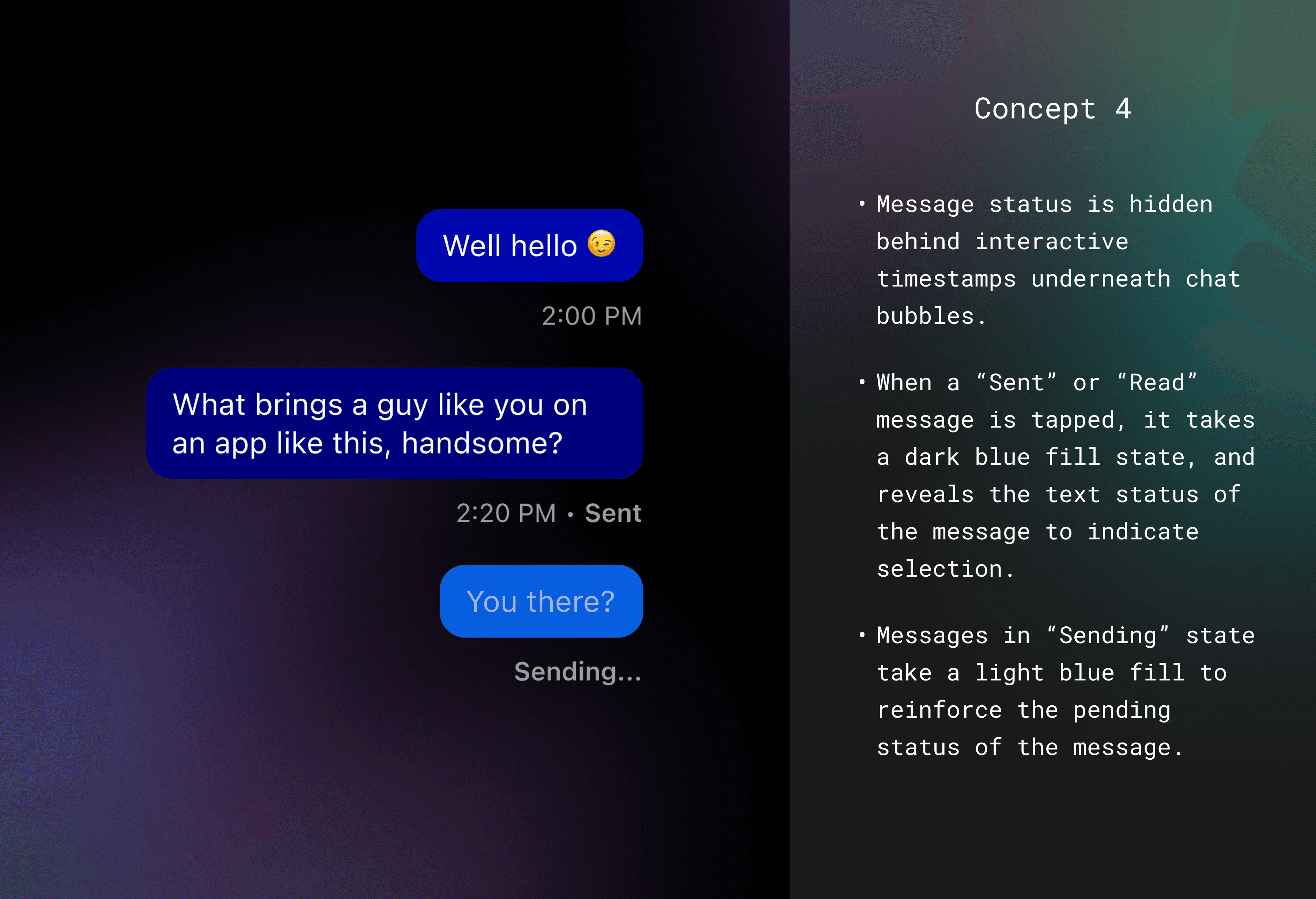
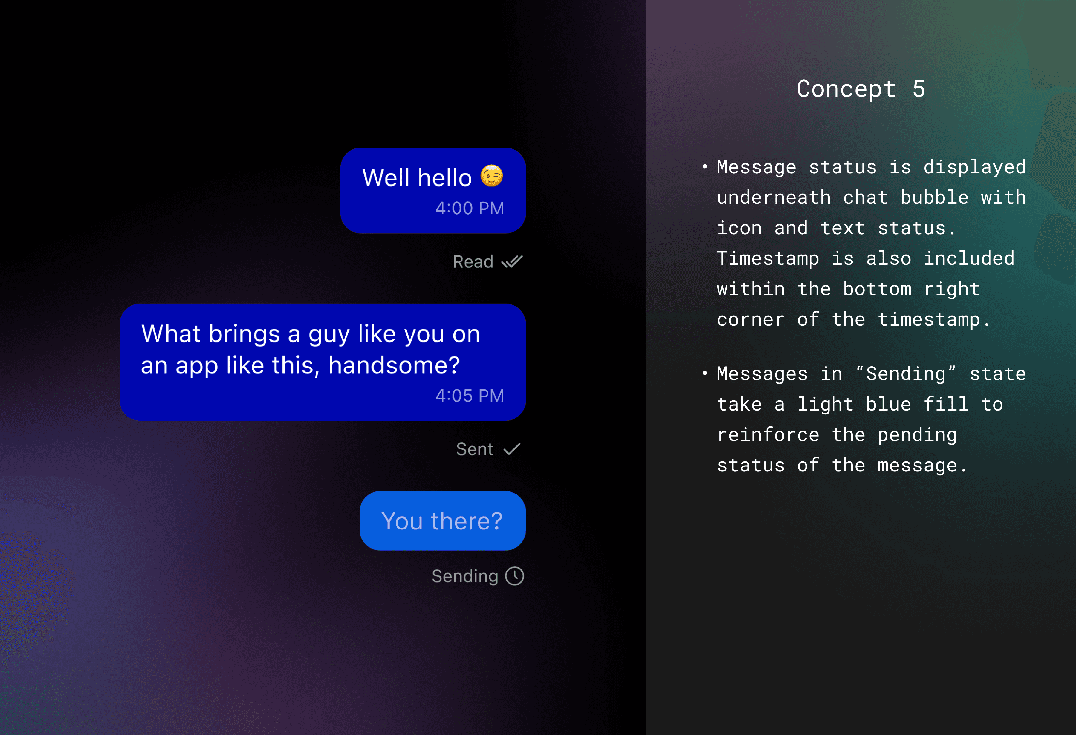
Different read receipts concepts created during the ideation phase.
I crafted five concepts for integrating read receipts, exploring options such as embedding the status within the chat bubble, positioning it below, and incorporating interactive elements. I also made strategic decisions regarding the usability of read receipts, considering the possibility of offering customizable options due to strong user demand. However, I recommended to the product manager that we prioritize a streamlined version for launch to gather real-world feedback and iterate quickly, which he agreed with.
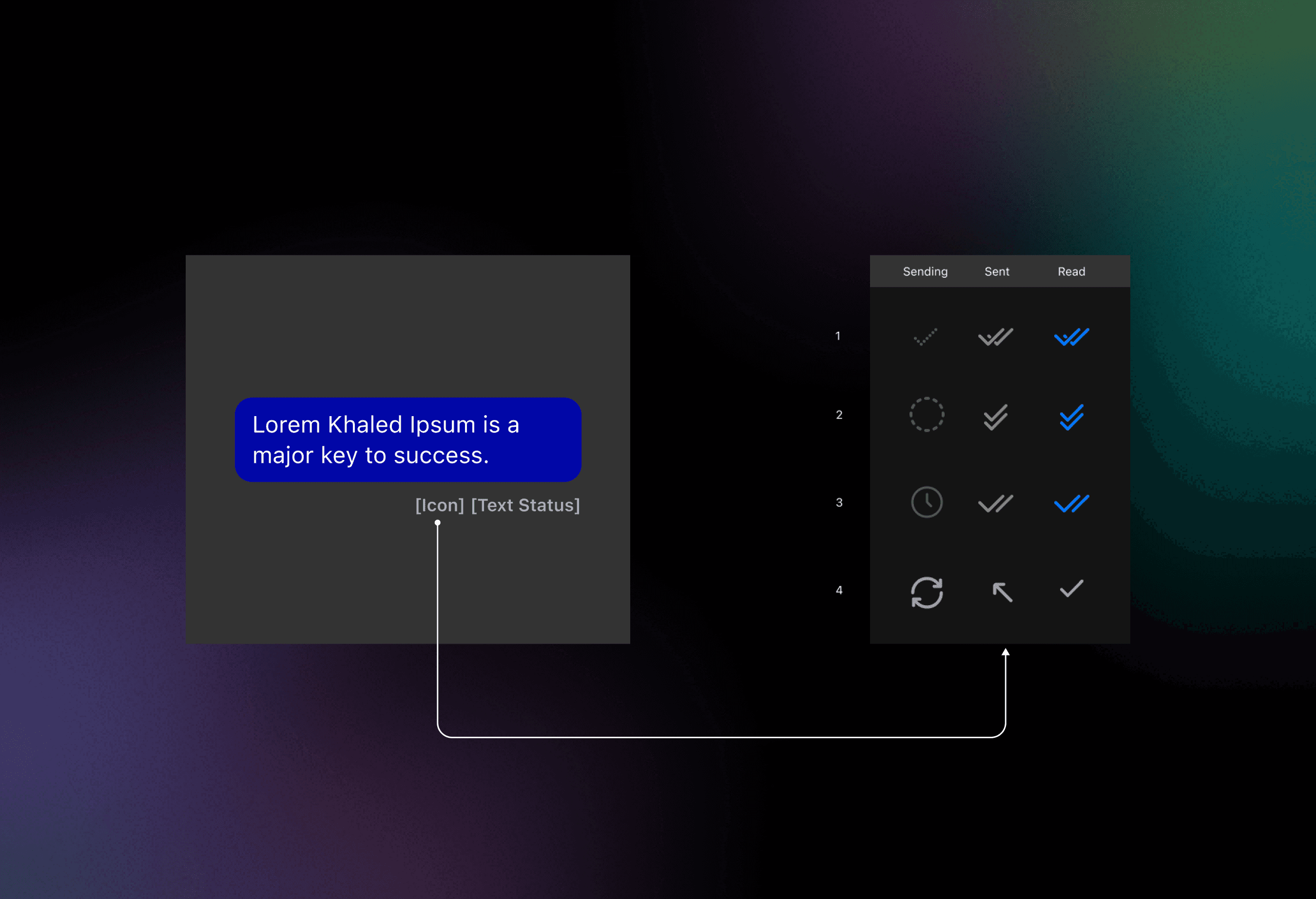
Exploration of icon designs for the three different read receipt statuses.
Ultimately, we chose to display the read receipt status with an icon and text directly beneath the message. I continued to iterate within this settled format, designing various icon options for the three statuses.
Results of a visual A/B test conducted using SurveyMonkey to gauge user preference.
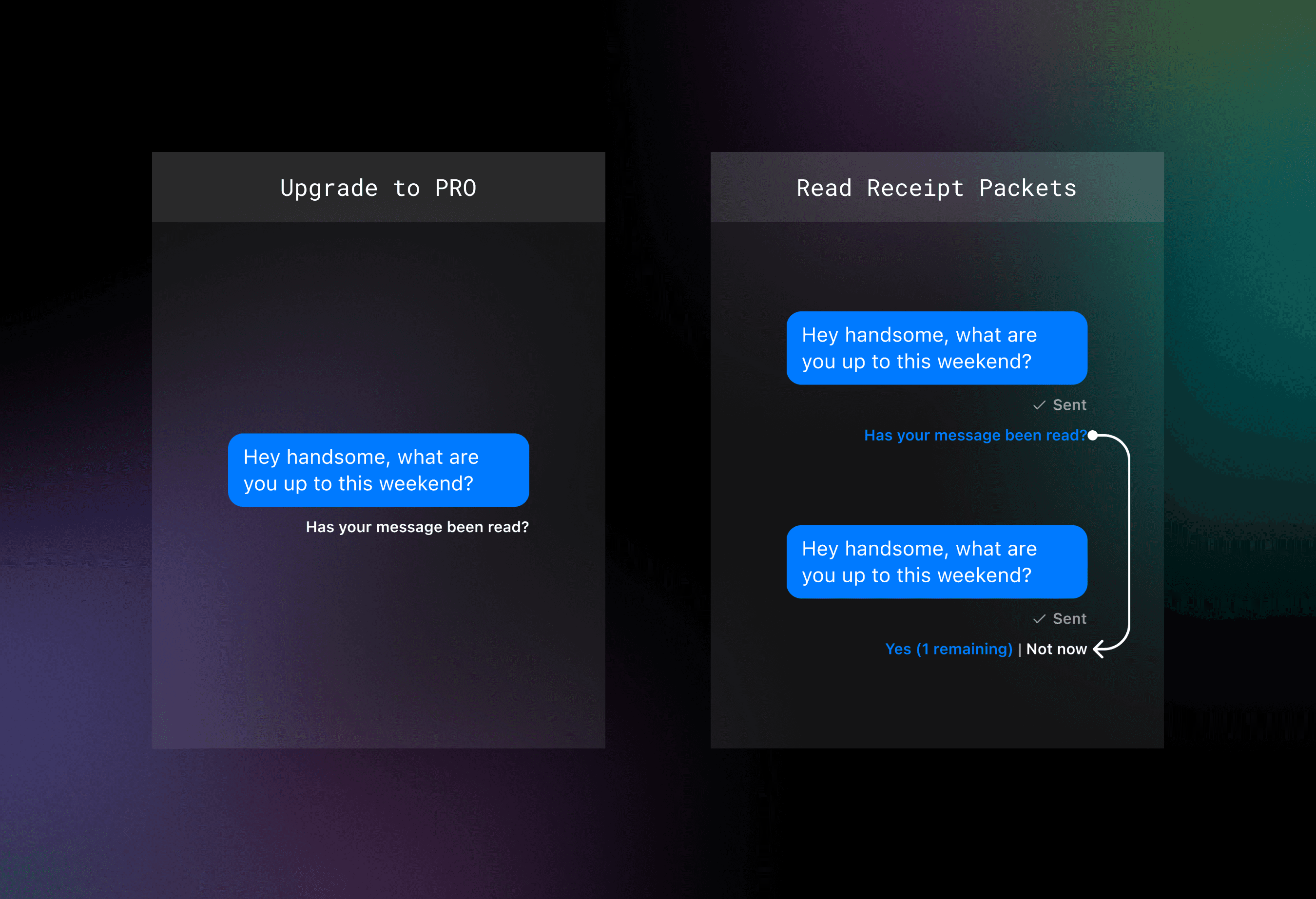
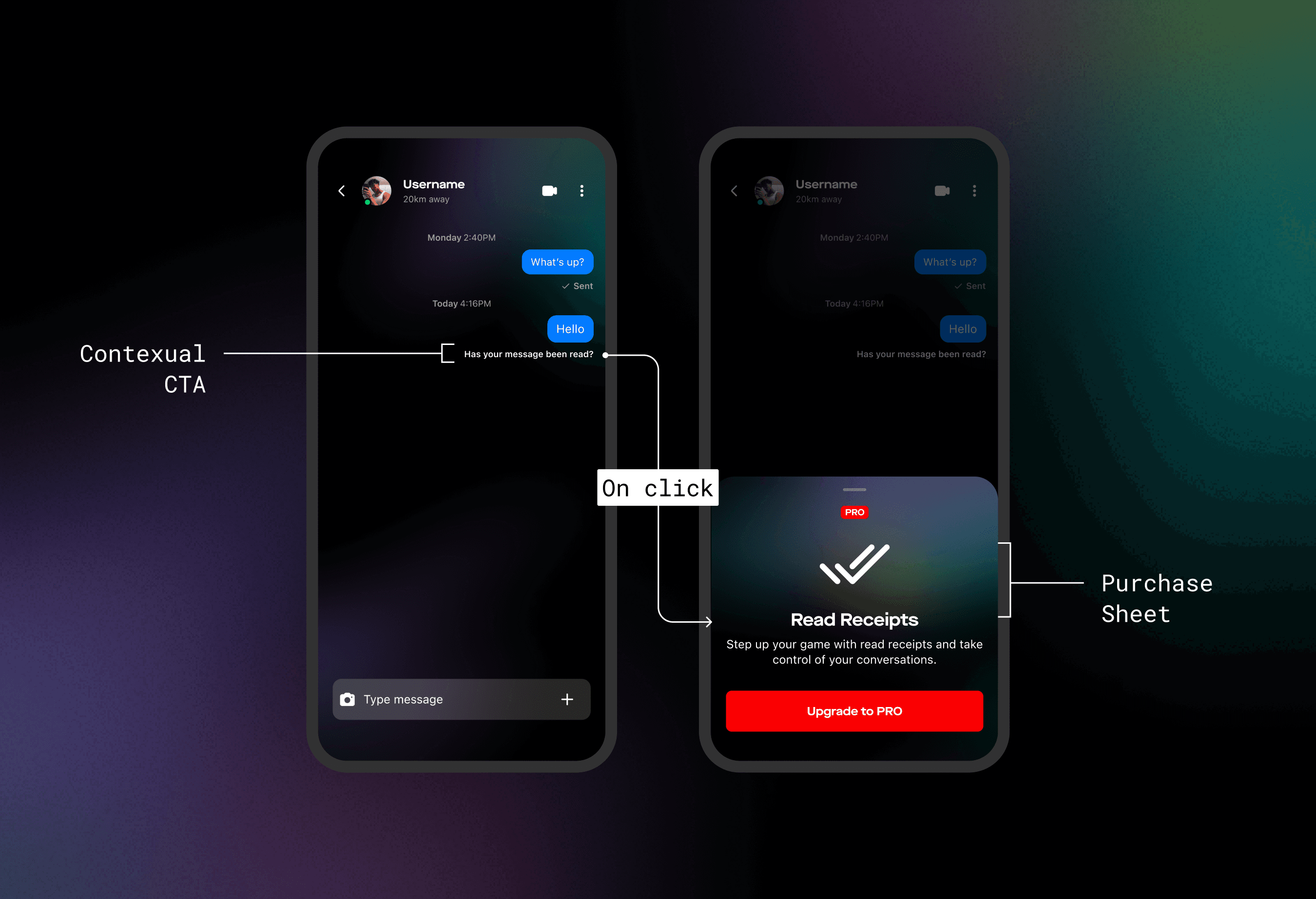
I identified a key opportunity to use this feature to boost revenue. Insights from my perception tests revealed that users were willing to upgrade their memberships for read receipts, leading me to develop two conversion-focused concepts with a contextual CTA. The first encouraged members to upgrade to a PRO subscription to access read receipts, while the second offered free users the option to purchase read receipt packets for individual conversations instead of a full PRO membership. To ensure a quicker rollout, I recommended driving free users to the PRO membership, as it required less engineering effort. We planned to revisit the second concept with the revenue team once we had more data.
Final Designs
When the product manager departed the team mid-project, I took full ownership of the product requirements, meticulously documenting user flows and presenting the final designs to the leadership team.
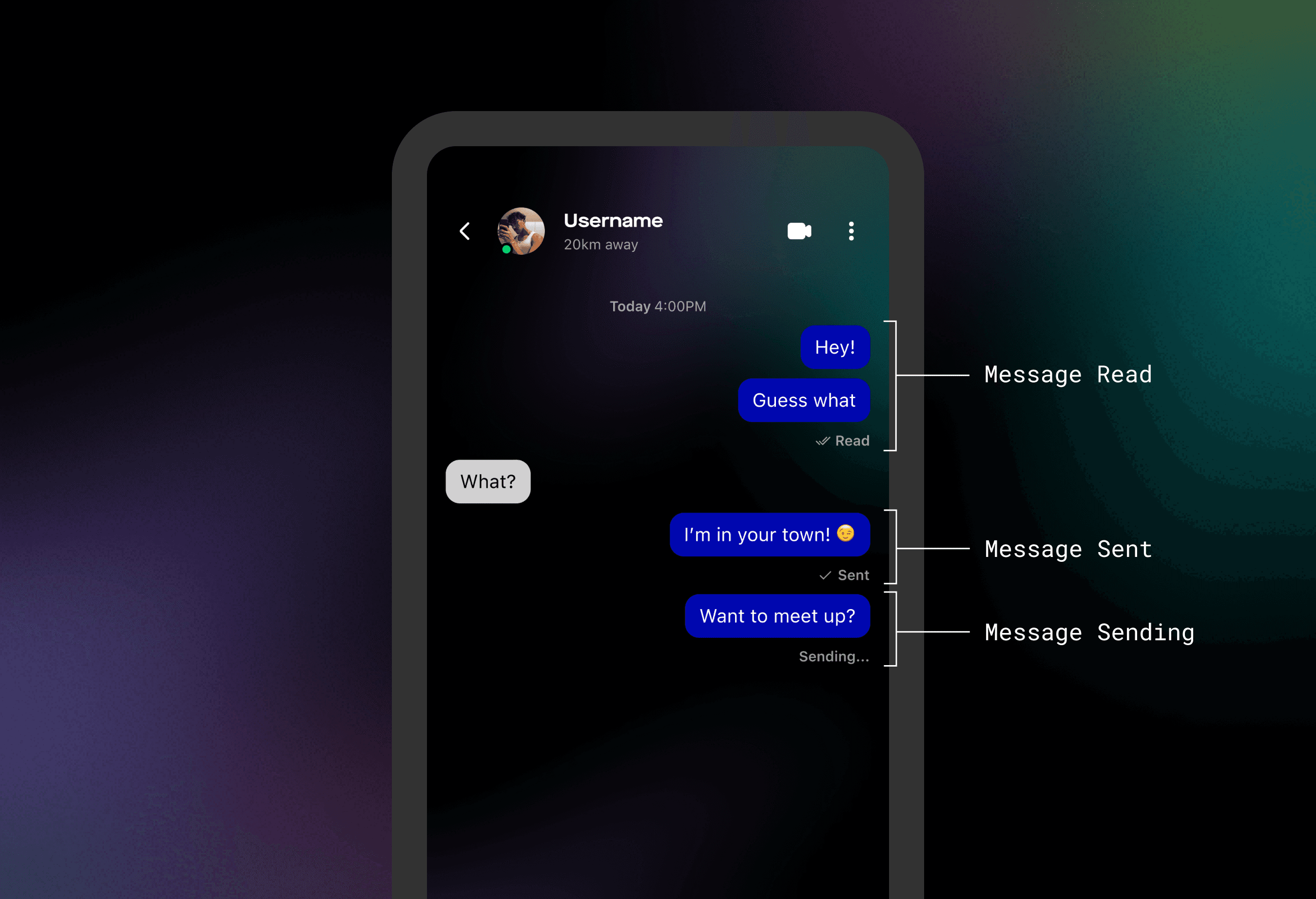
Final designs presented contextually within a conversation.
Final contextual CTA designs in a free user’s conversation, showcasing the purchase flow for potential revenue opportunities.
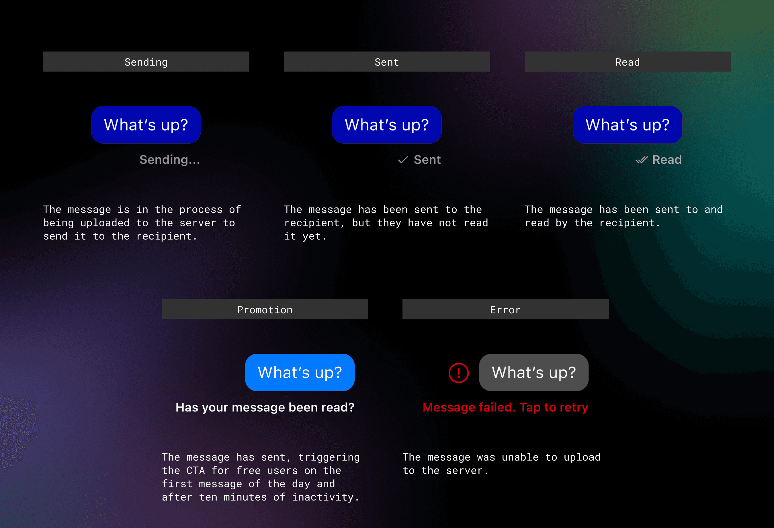
In my final designs, I chose to use a double checkmark for "Read" messages and a single checkmark for "Sent" messages, drawing on familiar patterns I identified in my competitive analysis. My goal was to ensure the designs were immediately clear, avoiding any ambiguity around icon meanings. I also decided not to include an icon for the "Sending" state, as it is highly temporary — most users never even notice it when their connection is stable. Adding an icon in that case would likely cause more confusion or distraction than value.
Implementation
My clean, well-documented solutions received high praise - leadership was particularly excited about the revenue-generating potential of my solutions. With this approval, I migrated all the new local components I created for the read receipts feature over to a branch of our design system while I awaited feedback from our engineers.
Component states in Figma featured documentation for when they are used.
I presented the final designs in a handoff meeting with the engineering team to run through expected flows, discuss edge cases (like error states) and allowing them to ask any initial questions about the project. This was their first opportunity to get eyes on the feature before scoping out tickets in an IPM session. The work was straightforward for the engineers - simply put, we were replacing the existing checkmark that indicated a successfully sent message with a new dynamic status below the message instead.
Preview of design system chat components after read receipts updates were included.
I facilitated a seamless handoff to their team, merging my new components in the design system, running design QA and participating in daily stand ups to keep the project on track. My proactive approach ensured that the feature was delivered pixel perfect and on time.
Results
We launched read receipts with our beta testers over two weeks, and then ran a survey on the new feature. More than 68% of our testers responded favorably to the survey. Later, upon hard launch, we observed a 5% increase in MAU and a 10% boost in PRO memberships within the first month. This success not only validated the feature’s impact but also set the stage for future 0-to-1 innovations within our chat experience.
Conclusion
Through the introduction of read receipts to SCRUFF and Jack’d, I was able to design a feature that not only met user expectations but also provided a new revenue stream by incentivizing free users to upgrade to PRO memberships. The project’s success underscored the value of thorough documentation, clear communication with cross-functional partners, and the ability to adapt quickly when challenges arise, as evidenced by my to need to step in to finalize product requirements when the product manager left. Ultimately, the positive user feedback and measurable increases in both engagement and subscriptions highlighted the impact of a well-executed feature that aligns with both user needs and company objectives, and set the course for additional 0-to-1 feature work in our chat experience following the completion of this project.
